Description:
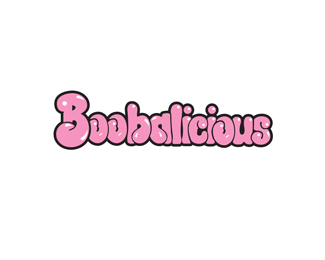
Logo for an annual breast cancer fundraiser held in Toronto for the past 8 years and Vancouver for the last 3 years. Proceeds benefit The Weekend to End Breast Cancer and Keep A Breast.
Status:
Just for fun
Viewed:
13630
Share:


Lets Discuss
This looks almost identical to the Bubblicious font. http://www.marieclaire.com/cm/marieclaire/images/gum.jpg I don't think you'll be able to get away with using it.
Replyi think the similarities were intentional...i've seen this kind of thing done before and in this case doesn't look like the customer stands to profit from using it and it is for a good cause so i would say you're probably allright...maybe im wrong...if it was for the branding of a company, thats where you'd probably run into some trouble
Reply%5EI agree. Looks intentional. Pretty simple actually. Find the Bubbalicious vector logo, remove the %22u%22, copy the %22o%22 and you're all set.
ReplyThanks for the input guys. You guessed correctly, the similarities of this logo to the Bubbalicious logo are intentional. The idea was to have the %22b%22 and the %22a%22 meet together to form...well...boobs :)
Replyha i did get a good laugh when i saw this mark....looks good...
ReplyThanks mega :)
ReplyHa!
ReplyYou would need Bubblicious approval I'm afraid even though it's for a non-profit.
Replysweet... :D
ReplyThanks Pierro!!*
Replyis this font still available? if so where can i find it? can anyone help please? thanks!
ReplyUnderkelly, the font in this logo was hand drawn. Sorry.
ReplyPlease login/signup to make a comment, registration is easy