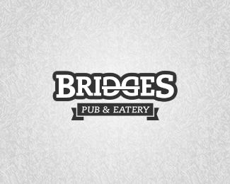
Description:
Removed the "illustration" above the type as suggested by FosterBarker and damn it, he was right! :)
Status:
Unused proposal
Viewed:
7362
Share:


Lets Discuss
nice. give that sub text a little room to breathe inside that ribbon and this is great! maybe the ribbon goes away completely? It's calling a lot of attention to itself, when the star of the show needs to be that DG.
Reply%5E good point.
ReplyThanks, good point indeed. Will give it a shot!
ReplyCool!!
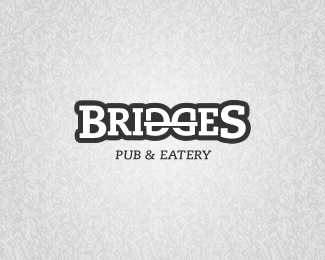
ReplyThanks guys, I really (really) apreciate your comments, here's a version without the ribbon: http://logopond.com/gallery/detail/138475%0D*%0D*Thanks again, Nathan!
ReplyWait, what? This made the gallery? Holy bridges, Batman! Thanks guys!
ReplyUpdated this one with an improved ribbon as well, as suggested by Nathan.
Replyvery nice%3BD
ReplyThanks mate!
Replysmart
Replyvery nice!
ReplyNice move %3B)
ReplyI'd like to see the %22bridge%22 between D and G with a slight arch to it. Would take the hard edge off of it.
Replyvorox %26 iografica: Thanks!%0D*Foster: No problem, credit where credit is due :)%0D*logoboom: Great idea, will give it a go right away!%0D*%0D*Thank you all very much for all the floats and comments!
ReplyGood bridge. I would go on such bridge
ReplyI truly appreciate the nod. Means alot. And congrats on making the gallery. All credit goes to you. The mark was there the whole time. This was a perfect example of less being more. Kudos!
ReplyThanks Alena %26 Foster! :D
ReplyPlease login/signup to make a comment, registration is easy