Description:
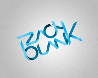
Working on my personal logo right now and I feel like something isn't right, but I don't know what it is. Any pointers?
Status:
Work in progress
Viewed:
1184
Share:


Lets Discuss
Nice work, I like this! The little piece sticking out the back of the 'H'. The darker shadows are too dark in comparison to the rest and it throws the balance off a bit. One more thing, I would place the 'C' behind the leg of the 'A'. :)
ReplyThanks for the pointers! I definitely want to re-design this, going with much flatter colors, and better technique with the ribbon itself. I'll definitely take your suggestions into account. Thanks!
ReplyPlease login/signup to make a comment, registration is easy