Description:
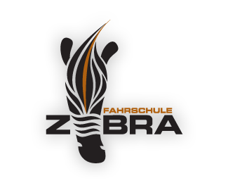
This is the logo for a management-company that owns and runs a lot of driving schools in Austria.
Status:
Nothing set
Viewed:
5088
Share:
Lets Discuss
The idea for the type is very good and I think it would be communicative enough rather than an entire zebra head.
Replydache makes a good point. Can we see how that would look?
ReplyI love the zebra head. It adds to to the logo. Also he could use just the head in collateral pieces. **The only thing I would do is simplify the head a little by putting the middle three %22flames%22 together (for lack of a better word) on its forehead.
ReplyI agree with dache in that the word is strong enough without the head, and with benpeck in that the head would be a really interesting piece for collateral. My thought is that you simplify and stylize the head to match the sleek and strong feel of the type. As it is I feel the rounded shapes, of the ears especially, give a more kid-oriented feel. Just a thought
ReplyPlease login/signup to make a comment, registration is easy