Description:
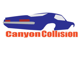
logo for local Auto Body Shop
Status:
Student work
Viewed:
1041
Tags:
Auto Repair
Share:


Lets Discuss
AMart77
ReplyI don\'t know about the car with no wheels, it makes it look as if something is missing. Also using that type of car (that clearly came out of the \'70 or \'80). Also how would this reproduce in B/W? I like the shape of the car but I don\'t know how it reproduces as a logo? It might be a bit cliche. I also would make sure that the reds are the same (taillights and the text). You also have some cleaning up to do: there is a gap between the back window and the blue that forms the tail fin (spoiler), gap in the logo where the side window meets the blue. These may have been intentional, but I wonder what they might look like cleaned up a bit. Keep it up this has tons of room to grow, I know that you can make that happen! Always push yourself!
I love the car. It has a fast look and I like how you added perspective to the image.
ReplyThe car looks really good, the shapes and the outline of the vehicle really gives it perception. I don\'t know if you tried it or not but the windows being white makes them look kinda see through, I feel it could look cool to maybe give the window a black sheen to it. Now that I look at it more I see the windows are gray, make them darker and I think it could make it look pretty awesome.
ReplyYour color combination has said \"Look at me\". And you have a lot of designers viewing this logo. So you have gotten attention. Good choice of fount. Strong solid company that fixes car. Car with out wheels? I have seen trailer with cars being pulled with cars with out wheels. It gives the impression that the car is ready to restore. Is this to far of a stretch of imagination?
ReplyPlease login/signup to make a comment, registration is easy