Description:
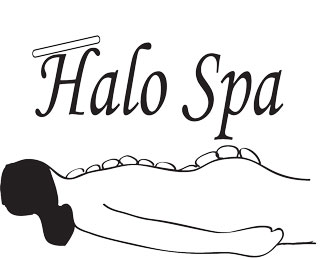
logo for halo spa
Status:
Student work
Viewed:
994
Tags:
spa's
Share:


Lets Discuss
impressive
Reply^ I bet it\'s for a spa!
ReplyThe logo looks good. The bar or elongated shape about the H on Halo is throwing me off a bit, I am just not entirely sure what it is. It would have been also cool to maybe have the rocks on the woman\'s back a solid color like black and not just outlines, it could really bring some depth perception into the image. For a black and white logo it looks good, I think it could maybe of had a color thrown in there somewhere to kinda make something stand out. Altogether though it is a good logo and lets you know exactly what goes on.
ReplyThe woman laying down gives the impression that this spa is a relaxing spa to go to. I like the formality of the font. The rocks throw me. I think that the rocks should be solid black. Over all the Logo gives a feeling of relaxation.
ReplyI think you hit the mark with the woman lying down and the rocks on her back. However, I agree with some of the other\'s comments on the color of the rocks. They should be solid. I also agree with the line above the H. I think it is supposed to be a halo. As a suggestion maybe redraw the halo to look like an oblong circle as though the halo is tilted back a bit making it stand out as a halo. Other than that I like the feel your design projects.
ReplySo when they continued asking him, he lifted up himself, and said unto them, He that is without sin among you, let him first cast a stone at her.
Reply^looks to me they all cast their stones at her.
ReplyI know and she's an Angel too.
ReplyAnthony, take a step back. Be objective. If you saw this on a sign or business card...would you walk in and plop down $100 for a massage? I can guarantee you nobody else would. So there\'s the target. A logo solution that provides the right impression and drives to action.
ReplyI know you guys are all students and learning. But you have to be your own worst critic. You won\'t learn much if this is an acceptable execution to you or to your instructor. Set the bar higher. Work harder. Your letting your computer skills limit the design.
^ I agree and also think more signage!(how it will be applied) Less is more.
Replythank you for the comments, i am really no where pleased by the outcome of this design. the more i look at it. the more i think it looks like a dead body with a bunch of warts coming out of their back. i am currently in the process of reworking the design. And i really appreciate all the feed back on my designs. only way i can get better is knowing where i am making mistakes and learning to be a better designer. Thank you
ReplyNow that\'s a great attitude!
ReplyAMart can you email your instructors name I want to ask him/her a few questions. thanks!
ReplyClimaxDesigns,
ReplyI would love to hear some of your feedback. How do you suggest I get you my contact information without disclosing it in this public forum?
Email me please [email protected]
Replysorry but... lol@josh
ReplyPlease login/signup to make a comment, registration is easy