Description:
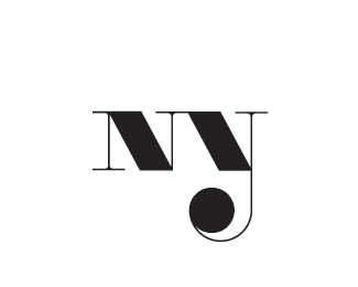
Initial concept - needs refinement... mark reads both MY, and NY. What do you see first? the MY or the NY? Thanks... Updated, now only reads NY.
Status:
Just for fun
Viewed:
2077
Share:




Lets Discuss
my
ReplyI see %22NNj%22...
ReplyNJ
ReplyNY
ReplyI saw NNJ too. What about making it twice as long as now... writing all 'MYNY' in this style. The funny part was gone then, but it was more clear IMHO.
ReplyNY, but i think it's strong as it is - but only with attached type.
ReplyNNJ
Replymj/ny
ReplyI see NY
ReplyNNY
ReplyThank you for the great feedback. Based on your opinions i can see i might have to change the concept a bit... The whole MY NY-concept is probable too complex to achieve.
Replyupdated!
ReplyMy kind of work Alex. May be a little bit too much geometric.*Some suggestions even if I don't know if it will improve something though. Connection between /y's loop and its descender could be smoother (gives the impression the loop is %22just%22 a circle, too much geometric). I would also like to see the y's loop less large (not sure same width as /y top part is a good thing) and the ball terminal less big too...*About the %22MY-NY%22 thing, have you try to slant the /N's first vertical stem? You coul also try to slant the /y's descender and loop and after that, slant the all thing... Not sure it makes sense :D
ReplyI saw %22ny%22 first, I like it though
ReplyPlease login/signup to make a comment, registration is easy