Description:
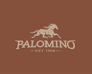
Logo I did for a horse racing team.
Status:
Work in progress
Viewed:
6376
Tags:
Wood
•
Western
•
Cowboy
•
Colt
Share:

Lets Discuss
great flow and fast horse! only thing that a bit out of since is the PAL for me... but those are hard to get even spaced...
Replyi feel like i have either seen this type treatment or done it before
ReplyThanks for the input Buro.
ReplyDavid, I have not seen something like it before. I tried to give it a western treatment with the horns, I wonder if there is something out there similar.
I noticed you like playing with type like that in some of your other logos. There are also a couple of typefaces out there that are not dissimilar. The trend currently seems to be those kind of flourishes on capital letters right now.
ReplyPlease login/signup to make a comment, registration is easy