Float
(Floaters:
29 )
Description:
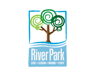
This logo was designed for a local neighborhood.
Status:
Nothing set
Viewed:
21886
Share:


Lets Discuss
Pretty
ReplyNice. I'm not a big fan of condensed fonts for logo's, but sometimes you have to and it seems to work here. Just a thought: I'd try River on top of Park so they could breathe more (i.e. not have to use a condensed font). Just my thoughts.
ReplyThis is coming along pretty good. It's an improvement from the previous versions. I like the repetition of the spiral for the dot above the 'i'. I think the type could use some more breathing room esp. above the cap 'R'.
ReplyLove the illustrative style of the trees. And I agree with logocritiques that the spiral for the dot of the 'i' works well. I just don't think this font goes with the whimsey of the illustration. Looks like the top and bottom portions are from two different logos, their styles don't go together. Maybe try a more humanist typeface, something with a little bit of curve to it?
ReplyFresh and innovative. I like.
Replythis guy, el mickeylozano, H., THANKS!**jglovier, logocritiques, kalico511, Thanks for your feedback I will look into different fonts.
ReplyTop Style!**Regards,
ReplyThanks Skrudis
Replyme likey...nice style
Replythanks .flo! you got a good portfolio too :)
ReplyHermoso trazo, adem%E1s se une arm%F3nicamente con la tipograf%EDa, muy bueno.
ReplyMuchas Gracias Ricardo.
ReplyPlease login/signup to make a comment, registration is easy