Description:
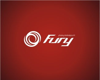
Work in progress so all comments welcome. This is for a sports equipment business. This whole logo can be viewed upside down as well with Fury being an ambigram. The 'scribble' is a 'F' gone energetically crazy!
Status:
Nothing set
Viewed:
4694
Share:




Lets Discuss
Interesting. When I read this I first saw...funy! LOL
ReplyI'm feeling this one so much more. Now all you gotta do is make 'unleashed' read as an ambigram. :-P
ReplyI smell a challenge...
ReplyThanks guys. But naah, I'll leave the crust work for Mr Langdon. Had enough ambigram for the week. I'm walking with my head tilted these days : )
ReplyWow...I think it's much stronger with this icon element. Very nice!
ReplyI think with someone of your skills, you can do a better treatment of the ambigram's lettering (which is genius BTW)
ReplyGreat logo! However, regardless of it being an ambigram, I don't think you should invert the word %22unleashed%22 because the average consumer won't get the whole ambigram thing anyway. All they'll see is an upside-down word and wonder why.
Replyno no no... you need a picture of steven seagal next to it!!! %3B)
Reply@ nido : now, that's what I call fury. And have him breakin someone's knee cap!!
ReplyI like the upside-down unleashed just because it would cause a consumer to say 'why.' Sometimes causing the viewer to react with a 'huh?' is just what an identity needs to be 'branded' permanently in their mind.
Reply...hence sho kosugi!!!
ReplyVery nice! The mark is great and the font treatment very punchy. Congratulations!
Replythis icon definitely complements the typeface. nice work!
ReplyI find it to be very contained fury, almost oppressed in its shape. I see two %22F%22's in the symbol although you mentionned one in the description, I am curious about this for the symbolism of two %22F%22's going energetically crazy in a fury represents a conflict rather.
ReplyHey dache, thanks for the comment. I forgot to mention that description was for v1. The mark above is actually a F and U combined whichever way you view it and both are trying to 'unleash' each other. Cheers.
Replynice
ReplyPlease login/signup to make a comment, registration is easy