Description:
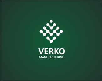
WIP. For a circuitry board manufacturer based in China. I tried to create as many V images in the mark as well as a subtle V M in the neg spaces. The mark is a representation of a circuity board. Still deciding on the colour scheme. The basis of this mark was actually from a design in my 'recycle stash'. Let's hope it can see the light of day!
Status:
Work in progress
Viewed:
10477
Share:


Lets Discuss
impressive mark ... so pure ... and so beautiful
Replylove this*
Replycongrats mate. nice logo
ReplyCheers guys. The client in China had problems registering the company name and is changing it to VERGO. I said thats fine as long as it still starts with a V.
Replyoi! that's one of my nicknames and two thirds of my surname.
Replyamazing
ReplyVM in positive and VM in the negative zone, only a master can pull it off! :)
ReplyBelo gr%E1fico, parab%E9ns!
ReplyThis is so nice!
Reply@Matt: Thanks buddy, your royalties cheque wil be in the mail %3B)*@Ljubomir: Thanks mate. Your Mr Whale was pretty darn cool!*@Alen: Mate, I'm far from being a master but thanks for the praise! I'll definitely work towards it!*@Bega: Obrigado pelo elogio! (I hope Google Translate has done me justice %3B)*@Muhammad: Thanks! And your CognitiveBits biz cards were amazing!* *
Replygreat symbol! complex but clean
ReplyInteresting, really similar to a modular font I designed a couple years back. It's funny how designers can come to similar points from such different angles.**http://fontstruct.com/fontstructions/show/liquiglyphs
ReplyPlease login/signup to make a comment, registration is easy