Description:
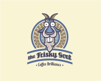
Rebranding of a trendy little coffee place in Brissy CBD. The name is abit weird but its popular among locals and have established a regular clientele. I tell ya, what they make puts my Nespresso machine to shame.
Status:
Work in progress
Viewed:
6923
Share:

Lets Discuss
Oh I forgot to add that the wreath are actually hoof marks made to look like coffee beans. Cheers.
ReplyVery interesting:)*But I think the font is too decorative.*And whether the prefix %22the%22?
Replyridiculous! Ha! Love it. great character.
ReplyClever goat*G reads as S
Replyso cool Norman ... like it !
Replyhoooo ! cool !
ReplyFun logo!
ReplyVery fun. Love the hoof mark/coffee bean touch.
Replyfunny :D nice character approach.
ReplyI love it when the logo makes me smile :)*This goat is fantastic!*I agree with @sbdesign that it might look better without %22the%22.
Replythis is ridiculous)
ReplyThank you all for the comments and floats AND that G-Spot!**And a special thanks to Sergey. How can you not thank Sergey %3B ) Thanks SB!
ReplyCrazy goat. So much fun :)
ReplySo cute and funny. .. and so professional :)
ReplyPlease login/signup to make a comment, registration is easy