Float
(Floaters:
31 )
Description:
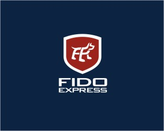
This is a proposed logo for a mobile personal pet grooming service.
Status:
Nothing set
Viewed:
6493
Share:

Lets Discuss
The very subtle 'F' and E' is a nice touch. But the crest doesn't seem right? The whole thing looks and feels like a security company to me. I still love your work though mate :)
ReplyI kind of have to agree with koodoz on this one. The typo is really nice and the mark is very good too, but I'm really wondering if it needs that shield/crest thing.
Replywhy no crest, ups uses a crest! I like it.
ReplyAlthough it does seem a little more like a security company, if their service is very professional, punctual and reliable, then I think it could work. Kind of reminds me of the way Geek Squad is branded. Not the logo, but just the feeling of very professional in-home service.
ReplyWell, ryan hit it right on the nail. The client wanted to portray a very professional 'no fuss' image to the business and the shield was actually their idea as they wanted something that demands attention and exudes authority at the same time. They want to portray an image that their team of experts knows exactly what they are doing and will get the job done right everytime. %0D*%0D*Cheers guys and have a damn good Xmas you all.
ReplyI love this. Although I do completely understand the logic behind the idea, Chan...*I still think it's a bit to corporate/security felling. Maybe it's the colors? Maybe some softer more fun colors? Some browns?**Great work as usual man.
Reply@chanpion, the dog is excellent with the 'F' and 'E' in it. i like the crest idea, but also suggest something other than a shield shaped crest. maybe try some other shapes for the crest. I like the colors.
ReplyDoes the 'S' and the 'L' represent something?
Replyi think the dog gets lost in the crest personally. dog is well done, love the line work.
ReplyPlease login/signup to make a comment, registration is easy