Description:
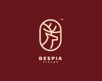
Deer logo. For training.
As seen on:
Dribbble
Status:
Unused proposal
Viewed:
4732
Tags:
hire
•
construction
•
animal
•
deer
Share:
Lets Discuss
Reminds me this one a lot
Replyhttp://logopond.com/gallery/detail/222032
I thought those are same designers!??!
Replybeside the deer in a rounded form what is similar there?
ReplyIt's for fun anyway.
To be honest, out of respect for original design that was already featured here, bratus and their client, i would remove it, or at least not advertise it as available for purchase...
ReplyI think you're being too harsh, Bojan. It's a similar idea, true (simple deer head in a rounded container), but it definitely doesn't look derivative to me. Honestly, it feels completely different. The typography is completely different, the colors are different, the art here is all stroked, and it's in an oval. This has an entirely different vibe.
ReplyI could see where a case could be made though, i wouldn't necessarily remove it from the site but certainly would not feature it. how you been jon!
Reply@David & Bojan, I love and respect both of you guys, but I really think you're treating this design unfairly. It bears a VAGUE resemblance in *subject matter only* to another design. The execution is completely different. How many "Art___" logos have we seen with a pencil that's also something else? Or logos that have a letter icon to suggest email?
ReplyI mean, look at this logo; it's a simple filled deer head inside a circle - more of a direct relationship to Bratus' mark than Darkmatters' design here:
http://logopond.com/gallery/detail/210856
That one was gallerized, yet no one fought over the fact that a deer head inside a rounded container was infringing on someone else's design. IMHO, some ideas/visuals simply just get repeated; it doesn't necessarily mean everyone's copying off of everyone else. To me, when dealing with popular subject matter/visuals, execution is very important. And all three of these deer head logos look very different to me. I would classify all of these as having the same concept, yes, but all are different logos in my opinion.
@David, doing well, man! Just getting into my groove after going FT freelance.
Jon, original was in circle also here, that sparkled my memory :) https://dribbble.com/shots/1985935-Deer-logo-Construction-GIF?list=users&offset=0 as you can see. Dunno, i am just trying to help here... before it's maybe too late :) bratus's client which holds original copyright prolly has the last word :)
ReplyI see what you mean about the original circular design, Bojan, and yes, it's definitely more similar to Bratus' design than this oval version. But even after comparing the circular version and Bratus' version side by side, they're both very different. Not only is the curvature of the deer head opposite, but the antlers go the opposite direction, as well. Not to mention that Darkmatters' logo is completely stroked. I realize you're just being helpful, which is great. It's important for us to look out for each other in this business. But in this particular situation, I really don't think the similarities are all that great.
Reply@atomicvibe Thank you.
ReplyNever ending story :)
Replyvery good!
ReplyThank you @veterdraw !
ReplyPlease login/signup to make a comment, registration is easy