Float
(Floaters:
46 )
Description:
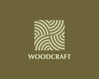
Logo inspired from tree rings arranged into a pattern.
Status:
Unused proposal
Viewed:
10286
Share:


Lets Discuss
Love it fogra, but the type seems too thin for the mark. The marks seems to overpower it and provides less balance.
Replythis could be really cool . . . try scaling back on the number of rings in each 'tile' and add some padding between them.
ReplyAah tree rings! Nice one! I agree with Bart's suggestion.**
ReplyThanks Bart %26 all for the suggestions. I will update the type alright.*@nima: I used Illy Willy.
ReplyUpdated now...
ReplyThere we go. I like that.
Replymuch better! :)
ReplyNice work ... i feel that something moving in this curves
ReplyOpArt by Fogra %3B-)
ReplyCheers chaps :)
ReplyThis is cool, did you do a version with different ring tones/colors? I love the look.
ReplyYeah, I did different versions mostly in earth tones are reversed out on white. I liked this one the most as it displayed the mark much better imo.
ReplyGreat!
ReplyThe idea rocks. A strong personal association is to the wooden cutting boards that are assembled of many small rectangular pieces with the wooden rings upwards. Dunno if you get what im talking about, but i guess it doesn't really matter.. **Anyway good work.
ReplyI have two words for you. Love it!
ReplyThank you Mads for all of your compliments on my work.
ReplyNo problem my friend.
ReplyGreat!
ReplyPlease login/signup to make a comment, registration is easy