Description:
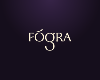
Personal rebranding (at last!) Fógra is the Irish Gaelic for 'warning', 'notice' or 'attention'...kinda like achtung really, except Irish. It's pronounced "fo-gra" btw :)
Status:
Client work
Viewed:
15608
Share:


Lets Discuss
this is a timeless logotype, great job sean**cheers!*sean
ReplyI like how u manipulated the type :) If u did at all. %0D*Did you use upside down L to make an F? and an O and reflected/rotated C to make a g? If u did, then I think u need to moce C a bit down it's too much into O. Try it I donno if it will look better, but just try and see, i guess. It kinda bothers me looking at it ritenow, seems like it needs to be fixed. %0D*%0D*Try using that accent on O as a slanting bar on R (by using P) that way u can move A closer to R to fix that gap?%0D*%0D*I hope u dont mind.:)%0D*%0D*xoxoxox
ReplyHey Sean congrats of your brand, I'll be honest have not quite figured this one out yet. Is this the final? or still working on it? I'm %22on the fence%22 this point, but jealous your way closer than I am :-)
ReplyI like the Gaelic feel to it...that deserves a Guiness
Replywith a BASS Ale.
ReplyAchtung, achtung! Sean's got a new brand! :)
ReplyThanks for the feedback guys and to 'abgd' for your thoughts - I will take your advice and upload an updated version soon.
ReplySO much character. Excellent.
Replylovely work my friend, as always
ReplyThis really has style and character. The **g** seems too large though. And I don't think the acute(or breve) needs another color.
Reply@Bojan and Cris: Thanks for your kind support guys.*@Julian: Thanks. I really needed someone to confirm those things to me as I wasn't too sure about it myself. I will have another go at it.
ReplyThis is definitely a unique and memorable wordmark. Well done.
ReplyThanks guys :) I'm still not happy with the 'g' though.
Replynice nice nice!! What's the typeface??
ReplyCheers. It's my own customised type based loosely on Optima.
ReplyFirst saw this logo on your Twitter avatar, got my attention straight away. Really like it, good job Sean!
Replyis there a caricature at the O and the G? eyebrow, eyes and nose...?
Reply@JustCreativeDesign: Thank you.*@Gaturro: Oh, I see what you mean...it wasn't intentional though :)
ReplyNice! Love the type and regal colors!
Replyyeah, the colours are great!
ReplyThank you, Mel and Gareth. I am using these colours on my website which will be going live this coming week.
ReplyI nice all type logo is rare to see, and much more difficult than building a symbol. Thumbs up dude!
ReplyWow, thanks guys and thank you David for the gallery spot.
ReplyReally good Sean, nice brand, Sl%E1inte!!
ReplySean, you must have made some changes? Before I did not see your self portrait %3BP. Now I seem to see it clearly. a self logoportrait. Like the lighting also, Good job.
Reply@Rudy: Thanks, you have good Irish language skills too %3B)*@Mike: Yeah thanks, I changed the colours slightly. It is kinda a self portrait but my nose ain't quite so big :P
ReplyWell justified %26 deserved, Sean. Congratulations. Looking forward to seeing your new site.
ReplyThat's one sexy brand. Well done dude :-)
ReplyThis looks awesome!
ReplyThank you Gareth, Mads and Joe :)
ReplyHowdy Fogra, as a fellow Irishman and CI user %3B) I'm afraid I not liking this at all. While I dig the name and I while think its cool and brave to use gaelic I think the type is very weak, sorry dude, not meaning to sound harsh as I think your logo design are some of the best on this site. I think a lot more could be done maybe incorporate a modern twist on celtic art (not the stereotype derby O'Gill crap), especially into the G. Though as said I commend you for using gaelic, ya know the drill at home all the agencies have the usual cool names, the dynamoes, the Image now's, but I love to see Gaelic names especially Gaelic names with meaning, I love an%FA design in Tara, Co. Meath. Mick of CI with LiaF%E1il, Anyway my two cents....
Replysweet elegance fogra!
Reply@mcdseven: The logo was meant to represent me, my personality, my style. I was the client in this case. I did not want to use celtic connotations in my personal logo because it wouldn't represent me as an individual. Sorry to disappoint you but I do also respect your opinion as much as everybody else :)*Thank you Terry also.
ReplyI'm afraid I think think this logo memorable for the same reasons as the new aNiMaL PlANeT logo. The weight is just really off. The counters for all the letters are off, the 'O' and 'g' are enormous, the 'A' is too small (although I like the reference too your heritage). The width of the R/A also aren't balancing well with the opposite side of the 'g'. A bit more finessing and I think it'll balance out a bit more.
ReplyHey Sean, I'm on the 'love it, don't change it' side of things - I've always liked this one and am stoked to see it make the gallery.
ReplyI see the arched eyebrow, the spectacles, the nose and one beautiful type treatment! :-)
Reply@tconrad: Well I'm very happy with it and that's all that matters to me. Thank you for stating your concerns though.*@cseven: Thank you again Chris for your support.*@lboi: Thanks Sneh :)
ReplyGood job Sean. Hard to make a type logo stand out but this one really does it, saw the ghost of optima but you've made the type your own. Congrats
Replyat Fogra... jaysus not disappointed, look if your happy with it, brilliant, its hard to design for one self and be pleased with it. The celtic idea was only a suggestions nothing more. Anyway good luck and see ya around.
ReplyThank you folks :)
ReplyAchtung! It grows on me everyday i see it. It has become fantastic by now :)
ReplySean, I think this is a fantastic start to a great logotype. A couple of things I noticed and agree with are the 'O' and 'G' seem too wide in comparison to the other letters. Either widen the 'F', 'R' and 'A' or reduce the width on the 'O' and 'G'. In addition, the breve/acute above the 'O' could move up just a few pixels as it seems too close to the 'O' at the moment. Just some small points to consider. Other than that, great! It has a strong and memorable presence.
Reply@logoholik: Thank you Bojan.*@OcularInk: Thanks Kevin. As far as I am concerned, this logo is complete. The character widths are based on the dimensions of other fonts and are therefore mathematically accurate except for the 'g' which is perfectly centered to give the overall logotype a balance. The accent over the 'O' is also equidistant when compared with the curve of the left side of the 'g'.
ReplySometimes mathematics ain't enough. Visually, the character widths are off. If it were me, I'd fix it. But it's your logo. If you're happy with it, I'm happy. :-)
Replyi think so too... 'O' and 'G' looks wider than the rest
ReplyLet us all agree to disagree on this one, shall we?
Replyi like this... clean %26 memorable enough... plus.. maybe its me.. didnt see it in your description but i see a face looking back at me with a raised eyebrow (the o %26 g)... nice work mate...
Replyit was just a matter of time
Replysorry, I thought I had floated this a long time ago. error corrected. I've always loved this.
ReplyAgain, thanks guys for all your support.
ReplyTimeless, beautyfull, memorable, with meaning, I like this much Sean, congratulations.
Replyok Boss agree to disagree......psst.....psst....but it does prick my eye
ReplyLooks like it is sagging slightly in the middle but otherwise excellent!
Replyya know, i keep coming back to look at this every day, I dont know why? maybe because theres a spark of reminiscence of old gaelic signage, ya know the ones fogra, down the country they are still in place, and I like them signs but I have to admit this looks better every day I look at it and i fully appreciate now the hard graft ya put into it and theres me been an opinionated b*ll*x, so I say fair play this looks brilliant, it really does, I'll be keeping my eye out for your business card, Irelands a small place. Well done brother.
Reply%5E Ha! Thanks, Paul. I really do appreciate it. I still have to create my business cards yet though :)
ReplyThanks, Shaun :)
ReplyGratz on logofromdreams.com feature buddy! Well deserved!
ReplyThank you for your support, Alen. Much appreciated.
ReplyReally like the freshness and creativity of your logo work, including this one!
Replythis logo is great %3B)
ReplyVery nice. I love the type treatment. I think it's just perfect as it is.
ReplyOne of my favorite typographic logo :)
ReplyI floated a long time ago, but this is awesome Sean.
ReplyThank you, Joe %26 All :)
ReplyWell thought out. Love the unity from the 'F' crossbar to the 'A' crossbar. Nice personal mark!
ReplyLove it :)
Reply%5E%5EThanks.
Replynice type! love your gallery!
ReplyPlease login/signup to make a comment, registration is easy