


Description:
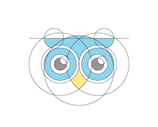
For an online recruitment agency, based in Canada. We kept it simple; wordmark with a secondary element. The owl, a client driven concept - was fixed around 'hoo' the sound an owl makes & as a phonetical spelling of who. As in, Hire who? Who to hire?
Status:
Client work
Viewed:
6416
Tags:
Recruitment
•
Career
•
Hoot
•
Hire
Share:




Lets Discuss
Well the website is up; the logo appears to have gone through a few changes though; http://hoolahire.com/
ReplyDid they pay you or did they rip your idea and have it destroyed inhouse?
ReplyYep, paid in full & I gave them all the artwork files... I guess it's just one of those last minute changes of scenery.
ReplyShame. Do you mention anything in your contract about tampering with the logo? If you give full exclusive rights, is the client allowed to do what they want with it?
ReplyI do have a code of conduct section, which also addresses things like 'I will not willingly plagiarise' etc. But, to be honest enforcing someone performing frankenstein surgery on a logo is a time-consuming, tedious process...especially when it takes several months to get their page together.
ReplyBut c'est la vie, I did the best I could do with the brief, the client paid what they agreed to pay, the client has their website up & they'll get their business. All is well, and the customer is always right - since this is an industry that is 100% about customer interaction.
Much prefer your design. They really have changed a lot. Their web version looks a bit sparse because of the spacing. Lost its punch.
ReplyI think the changes they made could have been a lot worse. At least there are no rainbow gradients :)
ReplyTheir version looks more like a lemur than an owl.
Replyonce the client pays for the logo, it is theirs; lock, stock and barrel. even if you send along a logo guide, the client still gets to do what they want with their logo. or there is a graphic designer who works for the company who wants to put their own spin/stamp on things. as someone pointed out, it could be a lot worse.
ReplyAgreed on all counts. But no matter, we can all see the intended vision :)
ReplyDefinitely agree it could be a lot worse, but why make those changes to begin with? The way you had it was perfect.
ReplyBuyers remorse perhaps... :)
ReplyPlease login/signup to make a comment, registration is easy