Description:
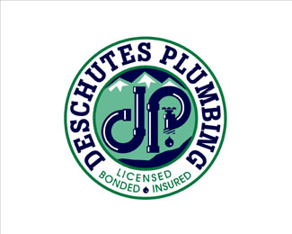
This is a logo for a plumbing contractor located in the resort community of Bend, OR - near the Deschutes River and the Three Sisters Mountains. It is featured in the book New Logo & Trademark Design (Japan).
As seen on:
Jeff Fisher LogoMotives
Status:
Client work
Viewed:
5983
Share:

Lets Discuss
An extremely busy logo but it has a good potential to it. Concerning the type I think the number of typefaces (or styles) can be reduced. Also in terms of typographical relevance %22dP%22 or %22dp%22 of the central mark fails to represent its uppercase counterpart. The type used for Deschutes Plumbing and the way it is orientated makes me think of 60's north american high school badges.
ReplyI can see what Jeff is going for, but it reads to me as %22J P%22 plumbing. I understand the %22ying and yang%22 aspect of the two pipes making the letterforms, but maybe in this case the uppercase D made from pipes may be more appropriate? Has this been tried already?%0D*%0D*And I think it can still work without the mountains in the back - unless this was a client requirement.
ReplyCraven91 -**The logo has been in use very successfully since 1995 - it looks great in an oversized application on their trucks. The mountains - the major geographic landmark for the region - was a client specified element, having been used in their previous identity efforts.
ReplyJeff -%0D*%0D*I was not questioning how successful the logo was. You always tell us which book of logos whatever you are posting has appeared in. You have the credentials.%0D*%0D*I was just giving an opinion on it - how it read to me.%0D*%0D*And I figured the mountains were a client spec.
ReplyYep, our jobs would be PERFECT - if those pesky clients weren't always getting in the way! :o)*
ReplyVery True...
ReplyNice work! I bet it looks great in use. A bit of kerning help on the title would have been great, but I think this is a solid piece.
ReplyJeff Fisher LogoMotives said on Jun. 13 '07*%22Yep, our jobs would be PERFECT - if those pesky clients weren't always getting in the way! :o)%22 **Totally. But then if we didn't make our clients happy, we probably wouldn't get the next job, eh?
ReplyPlease login/signup to make a comment, registration is easy