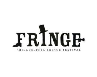
Description:
Logo for a live arts festival including everything from dance performances to magic acts to musical routines.
Status:
Student work
Viewed:
4076
Share:


Lets Discuss
like the shapes
ReplyI like alot the font, the oldschool feel and the shoe is brilliant. But there is a small problem with the hat, it seems to tip off from the I. The angle is not natural, and makes it seem out of balance. I would suggest that you try to balance it, making it look that someone really threw it on the I. Then it would be a kickass logo (imho).
ReplyBoerckel! I like this one. It's funny because I'm working on the Wilmington Fringe Festival's website right now...and their logo is terrible. I just made an account on here...getting it setup slowly.
ReplyPlease login/signup to make a comment, registration is easy