Float
(Floaters:
1 )
Description:
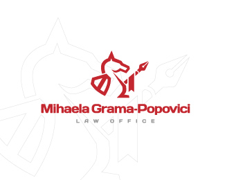
Law Office. Chess knight with a pen-spear and a shield.
Status:
Unused proposal
Viewed:
1985
Share:

Lets Discuss
Looks good. I would try to simplify it a little more because might be hard to see scaled down. Also, lose the backdrop it's not necessary.
Replythanks. but it looks good on printed material at a very reduced scale, i've tested it already before presenting it to the client :)
Replymaybe try changing up the horses head a bit- the ear looks a bit off.
ReplyAlready said, I would lose the backdrop. It distracts. Nice logo though :)
Replyyeh, thanks for the opinions guys :) i'm still waiting for the final feedback from the client. in my opinion the backdrop suggests more that is a chess knight, and not an usual horse...hm...
ReplyPlease login/signup to make a comment, registration is easy