Description:
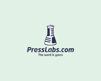
Logo for company which provide servers for bloggers.
Logotype created in my old style (two meanings in same icon).
You can see lab tube which made from newspaper.
You can contact me: all4leo@all4leo.lt
You can find me on: www.all4leo.lt
As seen on:
www.presslabs.com
Status:
Client work
Viewed:
4621
Share:
Lets Discuss
Very cool combination! Instantly recognizable.
ReplyOh guys, thanks for floats, very happy to feel your suport %3B)*Luma, thanks, my friend !!
ReplyLooking very good! Dig the type a lot!
ReplyHow come the logo on their site is different than this one?
ReplyI have same quastion, Alen, *but no answer yet.**Hope customer change logo to original soon...
ReplyAight man, hope you got paid for your work at the end.
ReplyYeah, everything is alright, thanks %3B)*By the way, Jonas, Muhammad thanks for you too %3B)
ReplyGr8!
Replyawesome little piece!
ReplyThanks my friends %3B)*
ReplyGreat double meaning. It's a shame your client bastardized your idea with an impostor logo on their site. Yours clearly looks like a newspaper rolled up into the shape of an erlenmeyer flask, while theirs looks like a bugle. :/
ReplyThis is a fantastic concept. The only thing that bugs me is on the website (for whatever reason, because it's not happening here) the beaker doesn't retain it's shape at a smaller size. It ends up looking more like a trumpet bell.
Reply%5EThat's because it's not the same logo.
ReplyReal nice concept, perfectly executed!
ReplyGreat concept and wonderful typo! Well done!
ReplyOh, thanks, thanks, for huge support, friends! %3B)
Replycould it be even more clever ? this design rocks !
ReplyPlease login/signup to make a comment, registration is easy