Description:
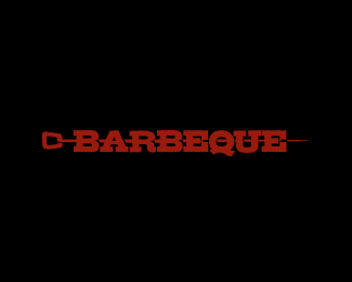
First proposal in the branding process for http://bluebamboo.co.il/ Feedback apreciated!
Status:
Work in progress
Viewed:
2894
Share:


Lets Discuss
great idea, a lot of potential here
ReplyThanks, man!
ReplyMan, this one rocks. I wonder what they will choose.
Replyawesome idea. Wondering how it would look with regular sized B's but I'm loving as it is.
Replysmart! wondering if you could just merge the 2 B's here?
Replyalso less contrast on the letters? kinda too condensed and bold.
Reply%5E Thanks! Mike, thanks, if the client chooses this one, I'll definitely look into some improvements.
ReplyYou should convince the client this is it, I mean look at that Bamboo in the B's, great!
ReplyThanks Sean, always far too kind.
ReplyReally Bamboo from two B! Great)
ReplyPlease login/signup to make a comment, registration is easy