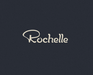
Float
(Floaters:
11 )
Description:
Mostly handmade jewelry. v.1
Status:
Work in progress
Viewed:
1791
Share:




Lets Discuss
I like the R better here myself, Stelian. Nice work.
ReplyThis one works better for me, I wonder if you need that c-h connection? All letters are separated, maybe it will be better to keep it that way. What do you think?
ReplyI appreciate the little connection there but I think I agree with Milo.
Replygood result my friend, i think i agree with Milou too :)
ReplyYou guys killed all the connections like the mob or somethin'. Thanks for the input. Updated.
ReplySometimes ligatures just overkill stuff, I vote for this one :)
ReplyBeauty. In great favor over the first version!
ReplyThanks for all the support!
ReplyThis is great!*Very pleasant type!
ReplyThank you Alena. I've scaled down the R, I felt it seemed unbalanced in this case.
ReplyPlease login/signup to make a comment, registration is easy