Description:
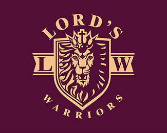
Created as a brand mark for a Christian apparel company.
(For anyone wondering, my Detroit Lions logo was a by-product of this project, hence all of the lions lately.)
Status:
Work in progress
Viewed:
10118
Tags:
regal
•
crown
•
shield
•
lion
Share:

Lets Discuss
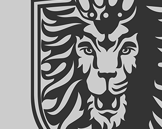
I really like this lion. My only issue is I think if you make the fur the same as the left side it would make the face pop more. The lighting does not seem quite right if that makes sense. The Crown is half highlighted and the right mane, but not the face. ???
ReplyI love it. I have no critique.
Reply@Logomotive Thanks! I think the little areas on the right "lip" were my feeble attempt to add some shading to the right side of the face without straightup hatching it, which didn't seem to fit the style overall. But I agree, originally I had planned to make half of the face in shadow to compliment the rest of it, but it kind of ruined the regal look of the lion so I left it as-is. I might try as you suggest and duplicate the left side of the mane to the right and see how that comes off.
Reply@TheArtist Thank you!
i love this one
ReplyThank you Oscar!
ReplyPlease login/signup to make a comment, registration is easy