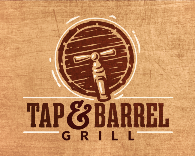
Tap and Barrel Logo
by LuBeraDesign • Uploaded: Jan. 24 '17
Float
(Floaters:
15 )
Description:
Logo created for a taphouse and restaurant.
Status:
Work in progress
Viewed:
4,512
Tags:
wood
•
tap
•
restaurant
•
logo
Share:
Lets Discuss
Which one did they pick, I like the symmetry of this one, but i like the overall feel of the other one. The darker ampersand and grill are throwing it off though, calling too much visual attention to themselves.
ReplyThanks David! The client actually chose this one, albeit in a different color scheme. I agree, the text should be in one consistent color and was changed to reflect that in the final version.
ReplyPlease login/signup to make a comment, registration is easy