Description:
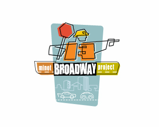
Logo used in city communications that informed people of the progress on a major street reconstruction.
To help with traffic control, etc. It was an older city street so I took a little retro feel to it.
logo was designed in 2006.
Status:
Client work
Viewed:
6176
Share:




Lets Discuss
This is a cool style.
Replythanks, danny. client liked it, which is always good.
ReplyVery cool Mike!
Replythanks, Alen. yeah your probably right. I thought the cars gave it a more retro feel. Old and new look of how cars had changed since the last time they redid that stretch of street. but they are making an unnecessary statement, I guess. thanks for the insight.
Replythanks, mike.
ReplyNice work my man!
Replythanks, Ivan. appreciate it.
ReplyThis is such a great mark. I love the continuous line style, and the intentional misregistration really adds to the retro vibe. Really awesome stuff, man.
ReplyThanks, Jon. Appreciate the comment.
ReplyVery nice.
Replythanks, Adam.**ow and thanks for the gallery post, didn't see that one coming. :)
Replyoops, meant %22WOW%22 not ow. :)
ReplyHey Mike, congrats on the gallery addition! That's really great. This logo definitely belongs here.
Replythanks, jon.
ReplyGreat! Mikeymike you are the best!
Replythanks for the kind words, Petro.
ReplyWow, i like it!
Replythanks, Mario.
ReplyPlease login/signup to make a comment, registration is easy