Description:
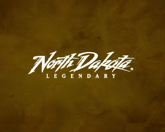
Logo for the state of North Dakota. done back in 2002.
As seen on:
Status:
Client work
Viewed:
7503
Share:

Lets Discuss
Wow Mikey, this is a pretty big logo for your portfolio. Why post so late? I've seen it around.
Replythanks for the comments guys.*@ mike. I don't know why, just been doing so much work for them on the ad side that it just didn't come to mind on the logo side of things. Me bad. Always liked it, just spaced it. glad i posted it now. :)
ReplyI love this lettering. The TV spots are great, too.
ReplyI agree this is great Mikey.
Reply:) cool, the strokes and style reminds me of some of Iskra Johnson's work.
Replymikey u are crazy...:P...this is cool
Replythanks, Chirp. always fun to travel the state and find unique things to shot for TV and print.*thanks for the kind words, Milou.*Mike, thanks for the complement of it reminding you of Iskra Johnson's work. she is remarkable. Love to be able to do lettering like her.*Nitish, thanks. My wife would agree with you on the CRAZY part. :)
ReplyReally awesome! I wish my type work was half this good.
ReplyThis is great Mike! It has a character and dynamic!
Replythanks, Chad. you have some real nice stuff in your showcase.*Tony, what do you think, do the billboards look okay?
Replybravo :)
Replythanks, serhos. you have some pretty fine type work in your showcase my man.*and thanks to you too, gareth.
ReplyHAAAA!! HA! good one, tony.:)
ReplyMagnifico!!
Replyplayed well ...hot and crazy
ReplyGreat portfolio piece, Mikey!
ReplyGreat stuff Mike!
Replythanks for all the nice comments. really cool to get so many from all you talented designers.
ReplyI'm from SD so I have to hate it. Sorry... :P Floated of course!
ReplyJust saw this in a commercial for ND. Amazing work!
Replyha! Trish. Thats a good one. :) North Dakota is the same as South Dakota only spelled different. :) All is good. Thanks for the float.
ReplyLovin' this Mikey, great work.
Replythanx, zephyr. You have to come and visit.%0D*
Reply2002. Great timeless design
Replythanks, action. Haven't done type with a brush in quite awhile. This one was fun.
ReplyI thought you did that logo Mike! Chad Hatzenbuhler here! Good Work! I just went on my own with Black Sheep Design out of Mandan, ND. We should chat sometime! Keep up the great creative work.**Later
Replythanks, gavitart.*@ chad. yeah, I knew you had started Gasoline alley site and magazine. How's that going? I'm out in Idaho now, i'll be two years in August. Nice to see you in the pond.
Reply-nice.*-What's nice?*- Your comment was nice, Alen.:)
Replyvery very nice, mike!
Replythanks, mh.
ReplyYou should get the key to the ci... state!
ReplyTHX, Ryan. i don't have a key, but they let me go wherever i want. (:
ReplyThey still use this, right? I was in South Dakota last weekend and I think I saw it on a commercial for North Dakota. :)
Replystill using it. I just am finishing up the 2012 and 2013 campaign direction. Its till holding its own, I think. cheers, Sean.
ReplyOh, yeah, great type. I know the feel of the area and it's a perfect fit, Mike!
Replycheers, Sean.
ReplyOne of your 'bestest' logotypes buddy! :)
ReplyTHX, Alen.
ReplyPlease login/signup to make a comment, registration is easy