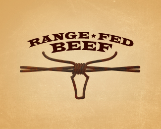
Description:
WIP. V_2
Another direction.
V-1 seen at http://logopond.com/gallery/detail/111375#Mikeymike_219376
Status:
Nothing set
Viewed:
2628
Share:


Lets Discuss
Is this one just too far out there? Steer head in reversed out tall grass. Curious to what you think.
ReplyI like it too.
ReplyIt is very nice Mikey. I do agree with zu about those changes.
Replythanks for the input, gentlemen. I am still working on this one, so i appreciate the help.
ReplyUPDATED. took up the type a tad and cut the grass down a bit.
Replydo u think the head needs a lil more aggression? looks a lil dull to me....but i dig the fell
ReplyI am afraid to get too aggressive with it because it is a health minded group. But I agree it could be stylized up a bit. thanks for the insight, nitish.
Replymaybe the face cut can be a lil sharper...and the grass could form some aggressive pattern ?
Replygood ideas.
ReplyLooking good, Mikey. Nice layout too with the type above the mark...that seemed to work out well.
Replythanks Ocularink. I am going to update soon, with some minor changes.
ReplyUPDATED. Cleaned up some of the grass and added some more shape to the steer to help match the over all look more. Thanks for all the suggestions. I feel this is closer to what we might end up with.
ReplyThis looks nice, but think there's a logo that uses a side silhouette (rather than the head) and has the negative space of grass. May want to check on Google %26 LogoLounge.
ReplyTallgrass Beef Logo by Gardner Design is the one I was thinking of, it's in LogoLounge 1 book.
ReplyThough it cleaned it up a bit and added some flavor to the design. :) never saw that lion attack.*Robert, thanks for the heads up. I'll check it out. You think this is too close to that one?
ReplyFound it on Gardner's site. nice. (don't have Logolounge book 1. maybe I should get it.:))*I think this is different, but know i may have to rethink this one. thanks.
Reply%22now%22 i may have to rethink this one. %5Ethat's what I meant to say. :)
ReplyI think it is great.
Replythanks, Trish. much appreciated.
ReplyPlease login/signup to make a comment, registration is easy