Description:
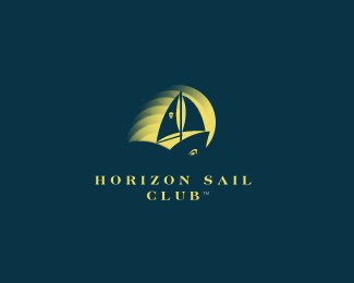
wip...working on a color ver...i fel gray is still more effective
ver 1 http://logopond.com/gallery/detail/92220
Status:
Nothing set
Viewed:
7291
Share:


Lets Discuss
Awesome!*
Replythis is still lovely, but i agreed that the grey version is better. that one has a more nautical feel.
Reply%5E%5E%5Ei agree...thx a lot...appreciate...:)
ReplyLooks great in color! :)
Replyye thx michaelspitz...but i feel the gray one has more depth...:)
Reply%5EDefinitely dig the grey as well... While that guy speaks in shadows, this one speaks in light... For me, they both play quite nicely :)
Replyi really like this, grey or not. its the sign of a good design when you can use other colors and it still really holds its graphic power. nice work.
ReplyI think I dig this one more than the black and white version. This color variation just seems like a more positive feel while the B%26W logo looked like the boat was being overtaken by some ominous black wave.
Replythx mike...we share the same opinion...:)*thx a lot ryanlynn...very interesting thought...never saw it that ways...thx agian for your insights...:)
Replycongrats!!
ReplyThere is something very striking about this one. Can you put the %22Sail%22 type on the same line as the %22Club%22 type? Right now, %22Club%22 looks kind of funny and off centered all by itself.
Replythx ocularink...u know what...i did try that...the name of the club is horizontal sail...putting sail wid club will make not much sense functionally...IMO...but thx for the observation..:)
ReplyAh, that makes sense. I was thinking maybe it was Horizon %22Sail Club%22. Cheers!
ReplyYou could reduce the space between the words of the top line and move a bit to the left the bottom line to try a better balance, not mathematic but visual.
ReplyI like this better.
Replyexcellent use of gradients!*
ReplyVery cool, the gradients are a nice touch.
Replythx guys ...really appreciate your all ur floats...:)
Replylogo theft...this logo was posted buy some shane form england i ges...clamming its his design...chk this out...the link has lot of pond designers logos...**http://cargocollective.com/shanecreative%23260365/Logo-Showcase*
ReplyWell, i couldn't open the link but this logo looks absolutly awesome! I directly saw a man working through a storm and the moon shines while water hits his face, lol. I would use a more softer moon-like yellow. But it's your decision - great work!
Reply%5E%5E%5Ethx for ur insights...:)
ReplyWow, really dig the mark. Color gradient is amazing!
Replythx again, much appreciated...:)
ReplyGreat showcase, and this one's a favourite of mine.
Reply%5Ethx sir
Reply%5E%5E%5E thx femili
ReplyPlease login/signup to make a comment, registration is easy