Description:
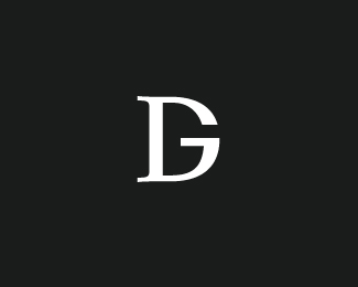
DG monogram
As seen on:
Unused Concept
Status:
Nothing set
Viewed:
17607
Share:

Lets Discuss
I have to find a use for this , it's very nice :)
ReplyThis concept is genius*
ReplyGreat one!
Replyomg :O I did an logotype just like that last week... It's gonna be used in a contest for my Graphical Design class... This was very wierd... :S
ReplyI think I ment YOU have to find a *use for it :)
ReplyAnother nice letter combo, Kev. Good one!
Replynice letter formation..
Replyi see a toothbrush!
Reply@ nido : LOL!!
ReplyIf Dolce %26 Gabbana ever need a new logo.**http://eng.dolcegabbana.it/
ReplyIf %3Ca href%3D%22http://eng.dolcegabbana.it/%22%3EDolce %26 Gabbana%3C/a%3E ever need a new logo.**
Replyyou should keep nice marks like this under wraps if you know what I mean
ReplyWell, if anyone wants it, they know where to find me. :-)
ReplyOc.. you and these damn unused icons. Man you should definately try and use them somewhere.
ReplyI just gotta get better at convincing my clients. Haha...**Don't worry, this will get used at some point. :-D
ReplyAnother cool letters combination.Great work.!
ReplyI tought it was new Dolce and Gabbana on the first look.*Great concept.
ReplyThanks to everyone and their feedback. How do I get in touch with Dolce and Gabbana? :-P
Replyhttp://www.digart.pl/grupy/1845/Graphic_design/ check :D
ReplyThanks tcheely. Anyone know how long that logo has been in use? I've never seen it before.
ReplyPity they stole your idea OcularInk...damn...i hate it when that happens!!!*p.s D %26 G...are they like not in the book?
ReplyCalm down, this logo I made few weeks ago, but its non commercial, and this is for group (all grops have logo) on this website. And afkoz I didnt see your sign before. Just haphazard. Regards
ReplyHi tcheely, great minds must think alike. :-) I checked out your website, and you have a great collection of logos. However, because this is original content and I am the author and copyright holder, I advise you to please remove the logo ( immediately ) found here: http://www.digart.pl/grupy/1845/Graphic_design/*Use of copyright protected material without permission is illegal under copyright laws. Thanks for your quick attention and understanding.
ReplyThat group is Graphic Design i.e., GD and not DG so that logo isn't appropriate.
ReplyAs far as my knowledge goes, %22an eye starts looking at a picture from left.%22:http://www.useit.com/alertbox/reading_pattern.html The serifs suggest the D, first. If you want to see a G first, the rounded part of the G should be seen. Moreover as the D shape is dominant over G, anyone will first see a D before noticing the G.*Very less people read it as GD, comparitively.
ReplyUm, I think my name qualifies for this!
ReplyYou absolutely need to show this to Dolce %26 Gabbana people. Their current logotype is nothing compared to this one :-) *
ReplyBy the way, I think saawan is absolutely right .. at least for people with native language that reads left-to-right.
Replyi really like this one!
ReplyInteresting discussion, guys. And thanks for all the comments.
Replyreally really strong mark
ReplyThanks Joseph.
ReplyI do not know if someone else already said this, the comments list is too long to check %3B-) but I saw this symbol and immediately thought %22Graphic Design%22. Right? Am I right? :D
ReplyEtienne, welcome back! Actually, there was no direct intention when designing the symbol. Was just playing around. But now that you mention it...hmm.
Replynot a bad idea for a blog... I think you should Kev...
ReplyThanks for the encouragement, nido. When I find the time, I'd love to!
ReplyHi! Do you sell it?
ReplyPlease login/signup to make a comment, registration is easy