Description:
Aqua
As seen on:
Unused Concept
Status:
Unused proposal
Viewed:
51037
Share:






Lets Discuss
Great job Kevin...!!! Very, Very, Very nice!!!
ReplyNice. I see a new trend forming....
ReplyVery nice work!!!
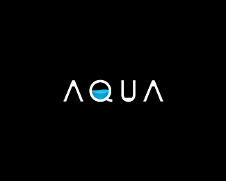
Replynice, but the flat spots inside the As and U is distracting from the water in the Q.
ReplyI think the question on everyone's mind is, 'Is the Q half empty, or half full?'
ReplyReally good work, maybe you could change the water to a wave.
Reply@ andersonmarques: Thanks, buddy!!**@ itsgareth: But I don't want to be a trend setter/former. Maybe a transformer, but not a trendformer. :-P**@ oronoz: Thanks, Allen!**@ KGB: Edited just for you. :-)**@ smartinup: Haha, interesting idea, but yea it might look funny. Maybe I'll give it a shot. Thanks!!**@ Lucidity: Hmm, half full for sure!! What can I say? I'm optimistic.**@ joseba: Done! Thanks!! :-)**@ anotheralex: Hmm, maybe I'll try that. Thanks!!**
ReplyKevin, I saw the original type you did and Loved it. It was unique but yet clean. I actually preferred that one, wish I had commented earlier.I did not find it distracting at all, it had style.
ReplyWell, shoot. Now I'm torn between the two. I think liked the other one better. Okay, let's take a vote. All those in favor of the original type solution say, %22I%22. For all those opposed...yeah, you get the idea.**Thanks, Mike!
Replyi... didnt see the other one.. however...i... do like this.. what about a drip hanging off the bottom of the Q.. cause it almost looks like a tube.. but leave it actually.. coolio!
ReplyHmmm.. I think I liked the original type a bit better. Great stuff Kevin.
ReplyReminds me of a BiOrb or a washing machine. I like this type, Kev.
Reply@firebrand, did you see the other?
ReplyYes I did Mike... I wasn't sure about the flat bits.
ReplyAwe com on guys be trend %22setters%22 not followers. LOL
ReplyDARE, to be different :-)*
ReplyOkay, I'm going with my gut on this one. The final is uploaded. Thanks to everyone for all your helpful feedback.**@ nido: That's an interesting idea, Nav. I think you're right though, I'm gonna leave it. %3B-)**@ jjjost: Thanks, man!!**@ firebrand: Ah, you're right. It would work for a washing/dryer machine company. Thanks for chiming in, Roy!!**@ logomotive: Rock on, Mike.
Replywell you got my vote on both. :-)
Replylooks stylish!
ReplyThis is great, Oc. I like it as is...but what do I know?
ReplyMan, I missed the first one! But this one is kool! Love the type treatment. It was what drawn me to it initially. I would make the water part in the 'Q' abit opaque just to give it some depth. Another great piece from the Doc.
Reply%22I think the question on everyone's mind is, 'Is the Q half empty, or half full?' %22**The answer is : the Q is twice too big lol!**Great logo. Ik looks both smooth and square at the same time.
Reply@ Logomotive: Thanks, dude!!**@ gstaltig: Thanks!!**@ ahab: More than you think. Thanks!!**@ chanpion: Chan da man!! Thanks!! I'll give it a whirl.**@ bbx: Lol!! Thanks!!
ReplyDache, I'd love to know your thoughts behind your decision to sink this logo? Not saying your decision is wrong, just curious on how to improve this logo concept. Thanks! :-)
ReplyDache and Lenin design have sunk like 90%25 of the gallery. Just an observation.
Replysimple %3D brillante!!!%0D*felicitaciones!
ReplyAgree with KGB, but it's very nice.
Replysimple, nice, clever and eye-catching. Great work!
Reply@ Lawrence : Thanks for the heads up.**And thanks efe-zero, bob sakoui, Webdesign, and bettina for your comments.*
Replythis may have already been mentioned, but the perspective given to the water in the q makes it look weaker than if it was just in an orthographic view. really dig the type treatment though
ReplyThanks for your feedback. I wanted the water inside the Q to appear as if it were sloshing/moving around. However, I can see your point. Thanks again.
ReplyVery nice logo %26 mark*Great!
Replysimply beautiful
ReplyThanks Vladimir, Nima and Erzio.
Replygreat job! i just got thirsty staring at this (which is good!)
ReplyBeautiful.**And with just some little work on the water on the Q you have a timeless logo.
ReplyThanks Jake. You have some clever and unique logos.**And thanks Julio!!
ReplySo sorry I didn't post sooner. I keep coming across this and have meant to tell you this is one of my favorites in the %22pond.%22**The water in the Q is cool and obviously fits here but my favorite detail(s) is the little added bits in the other letters.***Nice work as always!*
ReplyThanks so much for stopping by, Robert. I appreciate your kind words. I'm glad you noticed the little details on the letters. It was a tough call during the design process (whether or not to add the details), but some fellow logoponders convinced me otherwise. Thanks again. Take it easy!
ReplyMight even work with an added bit at the bottom where the Q stem starts. I too have never commented on how much I like this one.
ReplyI'll have to try that. Thanks for commenting, Glen.
ReplyI was sure i've floated this one before... top notch kevin!
ReplyThanks for stopping by, Dima!
ReplySee my above comment. Love the type.
ReplyWhat do you guys think? Too close? http://brandstack.com/logo-design/details/19944
Replyhmmm link is broken ...
ReplyLooks like the logo was removed. Here's a link:*http://www.ocularink.com/logocopies/aqua.jpg*The guy's portfolio's name is: oliverakos
Replyheh :) logocopies :) funny thing that over the time, as ones portfolio and recognition grows, one need to have similar folder available :) I see that logo is gone now. Good.
Reply:-D Haha, you noticed that. That folder is there to stay.
Replyaoua?! or am I missing something?
ReplyGreat stuff Kev.
ReplyNah, milou, the guy apparently can't spell either. Thanks, Joe!
ReplyPlease login/signup to make a comment, registration is easy