Description:
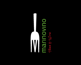
Italian restaurant logo a work in progress.
As seen on:
Status:
Nothing set
Viewed:
3758
Share:


Lets Discuss
Clever idea. The fork handle is too short though. And I think %22marinovino%22 needs to rotate 180 degrees so it reads down. Finally, %22Food %26 Wine%22 should read horizontally for better legibility.
ReplyThis has a nice quirky style about it. Especially as the fork prongs create both an M and a bottle lable. I agree that 'food and wine' could sit horizontally and flush beneath the fork/bottle. Looking good.
ReplyPlease login/signup to make a comment, registration is easy