Description:
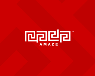
one shape was used and only rotated to form the letters r, a, j, and a spelling my name, Raja.
As seen on:
http://rajasandhu.com/
Status:
Nothing set
Viewed:
25447
Share:



Lets Discuss
I love the depth in this one!
ReplyGreat mark. And readability does not make a great mark...memorability does. So you did a great job.
ReplyI just visited your website and was impresed by your portfolio... I mean wow... respect! I love your works%0D*%0D*my favorites:%0D*-vapshare (...oh my god)%0D*-qommunicate (so simple)%0D*-flo (perfect)%0D*-inoplex (very nice)
ReplyI agree that a mark doesn't need to be readable to be recognizable, which is the only thing that saves this. It's not legible AT ALL unless you're told what it says, and even then, it says %22rada.%22**my first thought upon seeing the thumbnail was- that's not much of a maze, you can walk right through it. (no clue those are supposed to be letters.) One would assume that AMAZE is the name of the client and the maze is a supporting graphic element.**what's so great about making 4 letters out of the same graphic if no one can read them!
ReplyNice, but a little bit difficult to read the 'raja' section!
ReplyThanks guys - everyone makes a good point. I guess my intention with this logo is a lot different than your typical end-consumer logo/brand. I am not selling a product or service with this. It's solely my visual key. Also not trying to follow any 'rules' to be honest, your comments are valid nonetheless and thanks to all for looking. You can see it on my arm here, http://rajasandhu.com/raja_tattoo.jpg**This logo will be published in 4 design reference books in 2008.
ReplyI just think you need a website at the level of your identity. Your v2 needs to hurry!
ReplyNevertheless, this is one of my favorites of yours.
ReplyOMG! I am %22amazed%22 at this discussion thread!
Replyagreed - i really need a new site but I just cant make the time - thanks
Replyraja needs a v2 life at the moment.. (dont we all!)
Replyhahahah .. such narrow minds :)
Replyv2 life - i like that idea a lot
Replyhttp://www.flickr.com/photos/mr_carl/2342860542/in/set-72157604144345854/**bottom right hand corner
ReplyStill love your better, 100%25 better %3D)
ReplyHi--My name is Nicole.*I am interested in having you design a logo for my project. I can provide you all the details. I would appreciate if you could send me your contact and pricing information. I am contacting only a handful of people and I will be making a decision on price and quality fairly immediately.**Thank you*Nicole myofficedesk@gmail.com
ReplyExcellent work, Raja. Your logo should be seen more as a marking than the usual text-based. You know, like Apple.**I made my JCN logo many years ago after hearing that there were some German designers that tried to find the absolute simplest way to get their initials into a box.**Cheers from Montreal!
Replycheers!
ReplyReally beautiful, really, really wow.
ReplyRaja, i've been admiring your work for quite some time now...your logos are brilliant mate! I was on ebay a few minutes ago looking at logo design services and guess what I found? I found one of your logos being used by a wannabe designer as part of his portfolio! Here it is (hope this link works here. If not email me and I will send you the link directly): %0D*%0D*http://cgi.ebay.ca/ws/eBayISAPI.dll?ViewItem%26item%3D250286154325%26_trksid%3Dp2759.l1259%0D*%0D*I recognized your work right away the second I saw it. It's your SKYCUBE logo.%0D*%0D*Have a look at it and let me know what you think? You can sue this clown's ass dude.%0D*%0D*cheers,%0D*Patrick
Reply!!!!!!!! Everybody should check out the link that Patrick (user name: NEXQUNYX) provided above. He's linking us to a guy that's ripped THREE of my logos as well for his %22ebay portfolio%22 (Dirty South, Riverboyne and Navigator). And I see a lot of other samples that I recognize as other Logopond regulars' work. He's got a footnote on his site: * Bluepixel retains rights to post your logo in our portfolio unless you request us not to do so.**The jerk's emails are danny@bluepixelmedia.com and ebaybluepixel@gmail.com.**Let's all hit him hard.**Thanks for the heads up Patrick.
ReplyThis makes my blood boil. I've reported the charlatan to eBay.
ReplyThis has got to be the dumbest mongral I've ever seen.
Replydifficult to read RAJA in it...... mmmmmm
ReplyI think he has removed them all now!.. i don't know what annoys me more though.. that my work gets ripped off.. or the fact that it doesn't! its my ego that sways to the latter!**@muhanadhachem... %22difficult to read RAJA in it (for me)...... mmmmmm%22 %3B)
ReplyLOL Nido, hey let's take these to the forums guys. there's a couple posts there.
ReplyI wouldn't have noticed the maze said Raja if you hadn't mentioned it but I'm not sure if that was your main concern. Nonetheless, a fun logo!
ReplyNEXQUNYX (Patrick) thanks, I really appreciate that!**LOL at brandsimplicity and nido**Thanks Jessica*****
ReplyRaja, check this out - %22Noe%22:http://www.noe-interactive.com
Replyoh noe!
ReplyaMAZing!**Good work, very interest
Replybeautiful work 2creativo - thanks - hey clients check his stuff - http://2creativo.net/en/
ReplyRaja,**Even at first glance, I liked the vernacular of your logo, then I noticed the maze spelled out your name, almost like you have more to you that nobody knows about! Or its your 'secret' way of designing. I am a fan of this!
ReplyBlindAcreMedia, thank you.**You have cracked the code and the secret is out!**Thanks for your comments, appreciated. Enigma was a part of the design process, you got that right :)
ReplyAmaze...ing
ReplySomehow I never said how cool this design is.
ReplyMe neither! Fruggin' awesome man.
ReplyIrreducible complexity... Very perfect!
ReplyThank you all for looking!
ReplyGreat logo. Kudos
ReplyThanks felro.**Why are comments deleted from this post, looks like I am talking to myself in the begining LOL
ReplySweet mark! I agree with your opening remarks. Symbology in the abstract is what moves and stabilizes societies. When participants in culture get spoon fed narrow fare I think culture becomes gaunt. Narrow visual language, and I include poetics in the allusion, reduces into soulless cliches. Thats all....*
ReplyGreat Work!**Can you pass me your contact info to discuss logo design work?
ReplyI hear you impodster - since our primal times, all language was symbology, it's universal, and intuitive in terms of your comment about it's prevalence in society. For example, to a non english reading pedestrian at a cross walk faced with a %22walk%22 or %22dont walk%22 option, chances are, symbols would do the job much better. And I also agree with your points on the diminishing appreciation of deep rooted visual communication...not that this has anything to do with this logo.**If you are inclined, have a %22look at how this mark has transformed to now represent the corporate entity of my business%22:http://logopond.com/gallery/detail/93117
Replyhave to add a comment, love this logo, instantly recognize anywhere I see it. Little gutted to see it involve into the latest version, but like everything else in life it has to evolve and adapt. But this piece is simply... amazing.
Replythanks mcdseven - I should have explained this logo will remain personal while the other is going to be representative of the business side
ReplySaw this about 3-4 years ago and I love it as much now as I did then - the sign of a really great logo.**Timeless logos tend to be simple, but this has an extra edge to it.**Think I'll still be looking at it in 10 years time and liking it just as much.**
Replyhey thanks so much guys!
ReplyCongratulations on your award Raja, well deserved, guys, see this: http://www.free-press-release.com/news-raja-sandhu-wins-wolda-09-international-design-award-1276802752.html
Reply%5E yeah congtas Raja, glad to know you.
ReplyRaja is my sensei.l
Reply%22Raja Sandhu... was named one of the world’s best designers%22 NOT :)
ReplyRudy, thanks for posting that**and thanks guys
ReplySome one emailed me this link saying I should know about it, the designer is on logopond as well but doesn't have this one in his show case:**http://logoawards.mediabistro.com/node/349
ReplySorry to see that Raja.
ReplyThere should be a 'this logo has been ripped' button. If nothing else it would discourage a ripper ripping a rip... But then again...
ReplyI think the Greeks were the first to take credit...they ripped the idea from the Indians
ReplyOk..but this guy wins, hands down.**!image link!:http://bodytemple.net/store/images/greek_key_knit_shirt.jpg*
Replywhoops **%22click me%22:http://bodytemple.net/store/images/greek_key_knit_shirt.jpg*
Reply..and since you seem to be an CG fanboy, you might like this** http://www.designboom.com/weblog/cat/8/view/9262/tom-geismar-interview.html
Replythanks topicdesign
Replysuper, duper SWEET! nice one.
ReplyI love this! Awesome mark man, gj!
ReplyJoel, Pyroboy - thanks for looking
ReplyPlease login/signup to make a comment, registration is easy