Description:
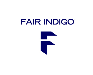
This is somewhat of a visual pun as the letters \'F\' and \'i\' interchange for visual focus. You will have to look carefully at this one :D
As seen on:
Status:
Nothing set
Viewed:
7655
Share:


Lets Discuss
I'm late to this party, but this logo is brilliant. I'd honestly say about 40%25 of your stuff should be in the gallery all of the time. Seriously. Inspiring work, man.
ReplyCheers, moverdrive!
Replyhaha lalohead - i'm still growing up
ReplyGENIUUUUUUUS!!
Replythe only thing that bothers me about this is the 3d rendering of the dot on the 'i'... in particular the bottom part of the side.. doesn't match with the rest.
ReplyNido, if you are bothered, I am happy!
Replybrilliant. not sure why I didn't notice this before.
Replythanks KGB - how's it going?**This is not really easy to 'see' so that could be why :)
ReplyWould be cool to see the front of the doors in a separate colour to the white background and blue. This would create a lowercase I for the indigo part :D
ReplyMissed this one. Two letters in neg space. Keeps me looking until I get hypnotized... (thump - hits the ground). Really, really good.
Replyget up jcnicholls, our hour is up
ReplyDamn i thought this was in the gallery ...
Replyit is...
Reply..
Replyyou two guys...hilarity, took me a while, but when I did, there was a lot of LOLz
ReplyHa im not following ....
ReplyTook me a while too!
Replytook me longer...
ReplyI got it :D
ReplyHmm im out of the loop i cant keep track ..
Reply%5Egot that on file Mike.
Replyha! - thanks Kral
Replywow this is very clever raja :)
Reply%5E thanks**This is what they went with, http://www.fairindigo.com/
ReplyAMAZEing!!, what a showcase!! when i grow, i wanna be like you :D
Replyhaha kiz nice linkbait!
Replycheck out this complete rip-off**http://www.brandcrowd.com/logo-design/details/29455
ReplyI tweeted it https://twitter.com/%23!/RajaSandhu/status/162879551767191552
Replythey have removed the violating logo
ReplyPlease login/signup to make a comment, registration is easy