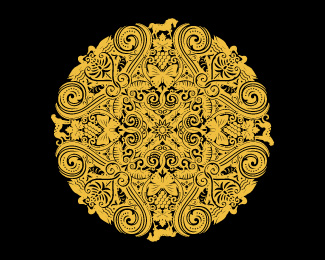
Description:
Reflecting Spier Wine Farm's holistic approach, this sparkling wine's filigreed gold symbol was inspired by the symmetry and balance of Buddhist mandalas. For a closeup, go to http://www.simonfrouws.com/images/mandala.jpg or see the packaging by clicking the 'as seen on' link below.
As seen on:
my website
Status:
Client work
Viewed:
10352
Share:


Lets Discuss
This is way too much for me, but it works very nice on the bottle.
Replywow!
Replywwwooowww! )
ReplyThanks everyone. I was debating whether to put it on LogoPond or not, because it blurs the boundary between design and illustration. Obviously not for use at small sizes!
ReplyWow, shame the space can't do it justice.
Replythis is crazy, crazy good also! O_O
ReplyI really stuffed it into that rectangle, didn't I! :-)
Reply%5EThat's fantastic!
ReplyAny chance of seeing a close up? Say a quarter of it?
ReplyHi Roy, did you check out the link?: http://www.spier.co.za/images/uploads/MCC-edit.jpg
ReplyI want to show it as it was on the packaging, as a full mandala. Out of interest, this was for a Limited Edition. Here's the more 'commercial' version, with a simplified coat-of-arms (although the foiling isn't perfect): http://www.wine.co.za/directory/winepicture.aspx?WINEID%3D24557
ReplyOops no. Sweet.
ReplyReally pops when done when metallic on the green bottle!
ReplyThanks for your kind comments - Alex, Mike %26 Harris.
ReplyThanks zephyr.
ReplyStraight into gallery of the 'Wine Label Pond'! %3B)
Reply*whistle* That's nice!*
ReplyHoly crap, that's nice!
ReplyHow does it look on a DVD spine?
Replyworks perfectly on the bottle! congrats.
Replyjoeprince - like a big gold blob! %3B-)
ReplyThanks everyone! This took bloody ages to complete - about 16 working files, including one completely different option (with an historical slant) at the client's request.
ReplyIf anyone would like to see the rejected option, check out: http://www.simonfrouws.com/images/mandala2.jpg
Reply%5E After looking at the second proposal, I don't want to know how much do you charge per hour %3B-) Great job on both.
ReplyWow, that other proposal is killer as well!
ReplyBloody Nora!
ReplyHope you got paid well for this project. :)
ReplyO_O (for second)
Replyfucken so much epta!
ReplyShanya, why do you have an animated gif for your avatar that shows drug use? It's really not something I'd chose to project a professional designer's image myself. Curious as to why you chose something like that.
Replyhey Mike, 22560kr.
ReplyAre you kidding me this is flippin' awesome. the unused version is incredible. the detail....WOW!!
Reply%22How does it look on a DVD spine?%22 %0D*%0D*Two options: You pathetic little clown are now able to name a more well-renowned publication than designanddesign http://www.designanddesign.com/share.php?id%3D13665%0D*you're published in or you keep your retarded jokes to yourself.%0D*%0D*%0D*
Reply%5E Harsh. **On topic: Good lord. I wish I had this sort of talent. Amazing Simon.
ReplyIn all modesty, I believe that my comments are mostly above average, which is fairly easy because that simply means you can come up with a proper English sentence and / or a thought of your own. %0D*%0D*Unlike all those people who try to use %22dvd spine%22 as pseudo running gag, I have published academic articles on films, been on DVDs and been quoted by media that are little more important than logopond.%0D*%0D*Do you believe we all can do without another %22dvd spine%22 nigga speak-burp by %22Joe Prince%22? I do.
Reply@barryconvex: what?! ...**Simon the other proposal looks superb too, great details looks gorgeous on the bottle!
ReplyIf you could be just a little less vague, I'll try to answer your question. I hope you're not presuming racism on my part which is not the case. %0D*%0D*Concerning the logo: Yes, it is incredibly complex but I see no reason it shouldn't work (and it doesn't seem to be the standard trade mark logo). From the pack shot it's not visible, but I hope it gets printed with some kind of texture / embossed.
Reply%5E JoePrince was reminding the classic LP joke, nothing more.
ReplyBarry, relax man - just a joke.*@Simon, great work again. Really enjoying your showcase :)
Replywell and truly worth the %243500US they paid - stunny on the bottle
Replystunning duh
Replyi could look at these illustrations for hours. lovely lovely work mate.
Replydont have any words to say:)
ReplyThanks everyone. Whoaah ... interesting comments column! I'm rendered speechless.
ReplyJoePrince - for another good example of irony / sarcasm / joke lost on someone, check out: http://logopond.com/gallery/detail/131988
Reply%5EHaha just read it man - funny stuff :) Apparently nothing is humorous anymore. I just feel bad for those who can't take a joke. Life's too short, lighten up people. Cheers Simon!
Replyshark entered in the pond...
Replylove the details..
ReplyWhy is not this logo into the gallery?
Replythanx Simon … love YOUR work !!
ReplyThis is one of the most well thought out pieces of art I've ever seen. Seriously Jealous.
ReplyThanks sbj, 1ta %26 Bernd.
Reply%5E%5E Wow, Mike. Your comment took me completely by surprise. To get such amazing feedback from such a senior (and supremely talented) member of LogoPond is a great compliment! I am forever grateful. Thank you sir! :-)
ReplyWell Simon it's like taking a bunch of tiny clever logos and rolling them all into one. Like the snowball effect.I don't know many if any that accomplish such a task.
ReplyHey there Mike - I like your descriptions as much as your work! Definitely no snowballs down here in Africa! %3B-)
ReplySimon, it's nice%5E)
ReplyPlease login/signup to make a comment, registration is easy