Contemporary Native
by THEArtistT • Uploaded: Mar. 24 '09
Float
(Floaters:
23 )
Description:
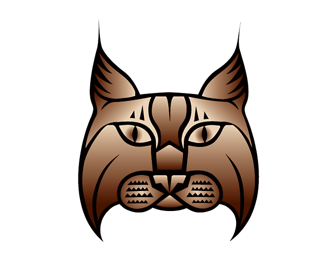
A bad habit of mine is to never let a logo rest. I'm always seeing improvements or variations. This is an update on color. Brown is my favorite color so I'm not sure why I wasn't using brown to begin with. The browns I'm using here are shades of buckskin.
As seen on:
www.contemporary-native.com
Status:
Client work
Viewed:
5,420
Tags:
illustration
Share:



Lets Discuss
I like this variation Trish, very nice :)
ReplyThanks Jen!
Replythanks for the floats guys! appreciate it.
ReplyTrish, just today I'm getting this message on every thumbnail asking if it's real or fake, do you know where to change that? thanks in advanced. rudy
ReplyNever mind Trish, I found it!
Replyyo, I just found it myself. think it's totally unnecessary. I mean what is the description area for anyway?
ReplyI know, it took me a while to change everyone of them, oh well. Good to hear from you.
ReplyThanks for the float Rudy!
ReplyThanks for the float David!
ReplyPersonal logo color change. Felt the gray was too contemporary.
ReplyTrish, I like the update, it looks good.
Reply_%22Felt the gray was too contemporary.%22_**funny that... I thought exactly the same thing about the word %22contemporary.%22
ReplyThanks Rudy. :P Nido.
ReplyThanks GeniusLogo, Jerron and Lecart for your floats!
ReplyThank you for the floats, Yuri and Eddie!
ReplyThank you Juli and Alena for the floats. :)
ReplyThanks all for the recent floats!
ReplyLong overdue my dear.
Reply@HayesImage only took 14 years, lol. I never expected it, though I have been doing my best to work towards it. I'm a little too excited.
ReplyWay too long, my apologies!
ReplyPlease login/signup to make a comment, registration is easy