
Description:
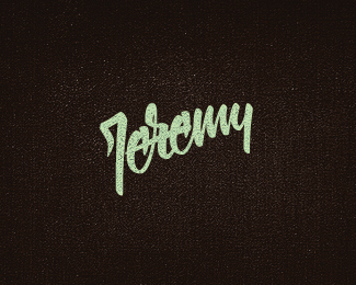
A few variations i'm working on for a client. Full project HERE
As seen on:
BEHANCE
Status:
Work in progress
Viewed:
9632
Share:

Lets Discuss
Looks very good to me, Matt. Nice type also!
ReplyI think you could loose separation line, if I had to complain %3BP
Replythanks Milou - glad you like and appreciate the feedback. will post back without the line
Reply*Updated... Thanks Milosz. I think you're right.
ReplyIcon is superb. Type, though....thought I was reading %22ecosuce%22 and my mind said %22is that supposed to say 'ecosauce'...?%22 the r needs more straightening out imho. Looks too much like a 'c'.
Replyvery very nice --- like
Replywow! gallerization... thank you thank you. And thanks JF, Luckily the client is still in the deciding process so i'll take that on board and present a fixed %22c%22. @ Bernd: legend! thank you.
ReplyNice indeed! Very cool!
Replyvery nice indeed!
Replyvery good! I like.
Replyyo David. can't float this! and want to.
ReplyLove it :)
Replychampions... thank you for the comments!
Reply@ trish... I'll just pretend you have. thanks!
ReplyVery good. Great details.
Replythank you bedemand!
ReplyPlease login/signup to make a comment, registration is easy