Description:
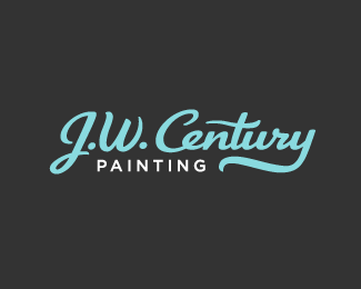
For a local painter. I'm working on a mark to go with this. Also, colors are not set in stone.
The "J.W. Century" type is all custom. It is loosely based on the font Kinescope, but as you can see herethere's very little left of that font in this design. The J is really the only letter that's still somewhat recognizable.
Status:
Nothing set
Viewed:
4534
Share:


Lets Discuss
Great lettering work!
ReplyLovely type work.
Reply%5E Yup.
ReplyThanks, guys. I'm still working on a mark to go with this one.
ReplyPairing a mark with that beautiful type would only ruin the design...nothing needs to be done to this IMO.
ReplyWell, I would still like to relate the logo back to painting somehow, in a more direct way.**I don't think the client is going to go with this anyway. I showed him the original font it's mildly based on (Kinescope) and he preferred that as it was, with no modifications at all.
ReplyPlease login/signup to make a comment, registration is easy