Float
(Floaters:
1 )
Description:
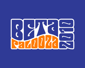
Logo for a student concert event.
Status:
Client work
Viewed:
2185
Share:




Lets Discuss
The Fillmore poster style is exactly what I was going for. Looked at a bunch of them for reference and inspiration.**As for the background, this one is intended for a t-shirt. I think they wanted either orange or blue for a t-shirt (It's the colors of the organization) so the idea was only to use one or two colors for printing.**I could just do the two colors against white, but I'd lose the outline, and I like it.**%3Ca href%3D%22http://gyazo.com/e84d49fd6b7596c7a07aceacd25622b9.png%22%3EHere it is against white%3C/a%3E %3C--Click**%3Ca href%3D%22http://gyazo.com/d5bb49b8b21b67e94f3bcd4ef415f8b0.png%22%3EHere it is against orange%3C/a%3E %3C--Click
ReplyPlease login/signup to make a comment, registration is easy