Float
(Floaters:
3 )
Description:
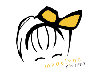
A logo for my wife's photography website.
Status:
Nothing set
Viewed:
4905
Share:

Lets Discuss
This has lots of potential. :-) Couple of things maybe to consider: My eye wants to get stuck around the girl's bow. It may be because it's the heaviest dark area in the logo. Also, the right side of the girl's head doesn't feel in balance with the left side of her head. It looks a little awkward. In regards to the type, it seems too small. Maybe by bumping up the size of the type, everything will flow better. Just some thoughts. Good work so far.
ReplyThanks ocular, I have been trying to put my finger on what needs to be improved!
ReplyYou're welcome. :-) It's coming along nicely. Another quick thought, you may consider working on the bow a little bit more. Perhaps by illustrating it slightly more literal and recognizable. As it is, it reminds me of a pair of sunglasses upside down. :-P
ReplyCute logo %5E . %5E Reminds me of by baby sister when she's smiling.
ReplyPlease login/signup to make a comment, registration is easy