
Description:
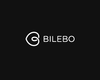
OK, so my personal brand has been on the back burner for a while now. That has probably had something to do with me not being a 100% pleased with my symbol. Loved the idea of it, but I couldn't get past a couple of things:
1. As simple as it was I felt that the symbol had two styles going on. On one end pointy, on the other end very curvy. Not pleasing to the eye imo.
2. The symbol felt unbalanced. It was hard to work with it in layouts.
3. The 2 gaps in the intersection of strokes made it feel a bit fragile or broken.
I feel that this update deals with all those issues, both the aesthetic and the practical ones. Taking away one of the gaps made the remaining gap feel more like a shadow than an actual gap, which was the idea all along.
Last, I feel it still reads as a heart, but not too much, which isn't really needed.
Whattcha think?
(link to old symbol http://logopond.com/gallery/detail/100576 )
As seen on:
http://www.bilebo.com
Status:
Work in progress
Viewed:
5142
Share:


Lets Discuss
What's up with logopond making my logos blurry?*A right click —%3E view image shows it in its correct size.**This is the right size, innit?
ReplyNice progression.
Reply%5EAgree, great turnout with this. Very aesthetically pleasing now.
ReplyLoving the refresh! Hot stuff buddy! %3B)
ReplyWhile I really like it, and since you are serious, after doing the %228 feet from the monitor%22 test, the mark reads more as a C or G from that distance.
ReplyThanks a lot guys! Good to hear it's an improvement :)**raja %3E I see what you mean, I can also spot a C in there, even tho I think the B is more obvious, but maybe I need to look at this with a fresh pair of eyes in a couple of days!*not sure how to make it more B-ish without straightening (what's left of) the stem.. hmm
ReplyGreat improvement
ReplyThis logo is very similar to %22Museu Berardo%22 logo in Lisbon Portugal... You should look to: http://www.museuberardo.com/
ReplyPlease login/signup to make a comment, registration is easy