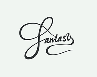
Float
(Floaters:
19 )
Description:
Word experiment based on a design drawn by hand with a brush pen
Status:
Just for fun
Viewed:
2477
Share:



Lets Discuss
Beautiful calligraphy!
Replynice!!!!!!!!!!!!!!
ReplyThis looks fun! The F has so sneakily crossed the t!
ReplyLooks fantastic! I might want to play around 's' a bit.
ReplyThanks for the comments! Wanted to try something different, glad you like it.**@eric - haha, yep it did that by chance in one of the many sketches, ended up keeping it.**@sparklin - Good observation. Wasn't really sure about the s, spent a long time on it but still think it looks quite static next to the other letters..
Replydig your style here, looks great!
ReplyI like it :)
Replylove your simple but powerful style!*
ReplyMay be make it intermingle with a and y. Let the stroke continue from a, through s and continue to y. Just thinking wild.
ReplyThanks all, appreciate it!**@sparlin - Hadn't thought of that! Was going for an 'sy' ligature and hadn't noticed how close the stroke from a to s was also. I haven't really touched this since, but if/when I get round to it, I'll try to think wild, too :)
Replywith fantasy!
ReplyHell yeh, this is great, unique typography. Love how the f is making also t.
ReplyThanks a lot! Yea it's funny sometimes the letters that end up making surprising connections. Glad you like it!
Replywonderful! i love this style
ReplyReally nice C.
ReplyPlease login/signup to make a comment, registration is easy