Description:
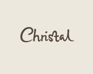
Part of an unused proposal. Hand drawn custom type aiming for a casual, friendly and warm feel.
Status:
Unused proposal
Viewed:
2009
Share:


Lets Discuss
Really like this one, Claire. You do some pretty sweet type work if I may say so myself.
Replyis the 's' and 't' suggestive for a heart?
ReplyThanks for the comments! **Vintage_chic: I quite like the ligature in this case, but maybe the connection with the top of the 't' could be smoother.. will have a look at it, thanks!**mfrank: While it wasn't initially planned, I first noticed the heart shape in sketches and decided to use it as a little addition to emphasize warmth, etc. **Joe: thanks very much - it means a lot!
ReplySo lovely. I was surprised how legible it was when I first read it, as on reflection I could totally seethe 'ri' lig as an 'n', but it still reads Christal. Awesome.**I agree about the t though, although I think it's the space between it and the s, and not the lig itself.
ReplyThis one is great, Claire.
ReplyMatt: Thanks for your comments! Yeah it's funny for the 'ri', I too was surprised that it worked so naturally. You're entirely right about the space between the 'st', I'll have a go at tweaking it - well noticed.* *Mads: Thanks, glad you like it!
ReplyReally nice. I just feel the h and r need a ligature, but given how you've kerned the whole word, i think it's right as it is. I still believe the h is isolated, probably because it's the only letter without a ligature.**
ReplyThanks Lecart! Yea good point about the 'h', maybe I could have it combine with the 'C' somehow.. or the stem of 'r' for 'hri' ligature (..maybe too far fetched?!) Anyways thanks again, appreciate it.
ReplyPlease login/signup to make a comment, registration is easy