
Float
(Floaters:
1 )
Description:
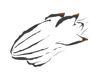
Logo for a basketball camp in Wilmington, NC
Status:
Nothing set
Viewed:
1024
Share:


Lets Discuss
Hey dbay, looks nice.*One thing I saw, you could incorporate an C and F by giving the ball perspective. Rotate it so we see more of the right part of the ball. In that way the left %22vertical line%22 could form a C and the right one an F.*Just an idea.
ReplyArt, great idea on the rotation! I had thought about trying to incorporate the c and f but hadn't quite figured out where. *The 'f' seems like a natural, but i really like the middle vertical line b/c it seems to give the ball some 'edge'. **I'll try it and see what happens. Thanks!**
ReplyGood idea, Art Machine.
ReplyPlease login/signup to make a comment, registration is easy