
Description:
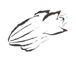
updated logo based on idea from 'art machine' to rotate and include 'c' & 'f' in the ball.
Status:
Nothing set
Viewed:
893
Share:


Lets Discuss
i know i've got some vector issues to work out (curves and left side seems off), but wanted to see any thoughts on this version with the letters included.
Replyi think is better that the normal non curved version..!
ReplyI really like the concept but I have to admit that I don't think I would have seen the C and the F if it weren't pointed out to me. I think part of the problem is that the far left lines on the ball don't incorporate any of the letters of your logo. So you're asking people to skip over the first set of lines and start associating the second and third lines with your logo, which isn't a natural instinct.
ReplyPlease login/signup to make a comment, registration is easy