Description:
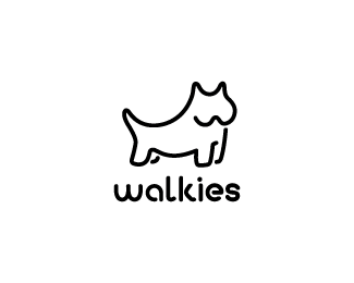
A local dog walking service. Client wanted a friendly and approachable logo in an illustrative style. I have incorporated a "w" into the mark to increase brand recognition coupled with custom designed typography.
As seen on:
Down With Design
Status:
Client work
Viewed:
6543
Share:


Lets Discuss
why you deleted the other istead of editing it?*anyway, it's like type and the mark is great
ReplyThe type goes with the icon really well. The dog's chops look a bit weird tho.
ReplyHmmm. How do you mean roy? I will admit I'm not 100%25 happy with it.
ReplyI don't know if it's too bulbous on the right or whether the jowls sag too much. The prominent legs could be extended slightly to improve the perpective IMO. Other than that I love the style of this, Gareth :)
ReplyCheers mate very valid points. I may look into after the United game %3B)
ReplyI think the mouth problem could be solved by making the w look more like the one in the type.
ReplyI'll give that a try babo, I just dont want it to look like he's got a butface, you know?%0D*%0D*I've extended the legs Roy, excellent call. Still gotta sort the mouth though, hmmm
ReplyGreat job...
Replycongratulations , good job on that *typeface and mark are awesome
Reply@babo: I don't really have a solution, but I'm not sure your suggestion would work. If he did, the dog may well turn into a beaver or bugs bunny type character.
Reply@babo: I don't really have a solution, but I'm not sure your suggestion would work. If he did, the dog may well turn into a beaver or bugs bunny type character.**By the way, excellent concept gareth!
ReplyMany thanks, but in my eyes it's still not finished!
Replyreally nice logo. if you are looking for something else to do with it, why not make it side-on , only have 1 ear, and 1 'mouth part'
ReplyHey pixelcraft, thanks for the suggestion. The main reason I want it face on i to incorporate the 'w' in there. I'm working on it as we speak so should have an update later on today.
Replyupdated, thoughts anyone??
Replymaybe give the front part (the chest) a slight arch or curve.
Replythe fact that both back legs (i mean legs furthest from us) on this are on the inside throws the whole perspective off.. if the hind back leg is on the inside then the front back leg should be on the outside.. at the moment this mutt is flexing in an awkward way!.. you need to bring the front front leg in till it aligns with the middle of the face %26 switch the front back leg to the outside.. so its like a revers L..
Replynido..you ave unlocked the mystery of this logo that has been making me feel completely happy with this logo. Thank you. Luckily I have a few days before I show this to the client so I can hopefully sort it out in time. Mikee, I'll give that a try too, I think it will make the dog look more %22proud%22. Just goes to show that a very strong knowledge of anatomy and the figure is one of the foundations of design, something which I need to brush up on me thinks.
Replygrrr...that %22making%22 should be %22stopping%22. It's late.
ReplyThe W for the jaw feels unresolved. It looks more like a cat. Also, the far hind leg is too long. I like the type, though!
ReplyCheers tdf, this is the final version I'm going to preset. Many thanks to all.
ReplyThis has come along nicely. Great job, Gareth. :-D
ReplyGreat Logo! Complex by itself Simplicity!!! Nice Work. Keep it up!
ReplyType melds well.**I seen a pair of breasts in the head which can only be a plus.**Great job.
ReplyAre you being serious? Its face looks like a pair of tits and its hind legs look like a cock but i think this is a wind up.
Reply@Rotwart: Deadly serious.
ReplyI think it's an incredibly apt image :)
Replythanks josh, I had a sneek peak at your site earlier, looking good man
ReplyMy brother's girlfriend says %22walkies%22 a lot with a really stupid look on her face, so I find this hilarious. Nice work.
ReplyPlease login/signup to make a comment, registration is easy