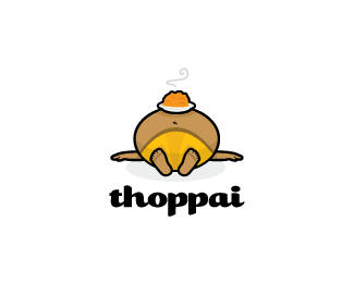
Description:
A worldwide Indian Restaurant review website. "Thoppai" translates as "tummy" or "pot-belly".
As seen on:
Down With Design
Status:
Client work
Viewed:
10258
Share:





Lets Discuss
HAHAHAHAHAHA, very cute! :)))
ReplyBrilliant, love it!
Replyhilarious!
ReplyLove it, Gareth :D
ReplyLovin' the perspective!! Nice work, dude.
ReplyLOL! wanted more but just could not do it. Must be some pretty good stuff mate. Making me hungry now.Thanks for the laugh.
ReplyGlad it struck a chord with everyone, like him I think I'm just about done %3B) Did anyone notice the question mark in the steam or was that a little too subtle?
ReplyCool :D lol!
Replyvery nice! also love the perspective
ReplyCool! i didn't see the question mark.
ReplyThanks! Yeah me neither!
ReplyI think I over did it on this one ha!
Replyha ha just like he did %3B-)
ReplyLooks great, Gareth. I like the new color scheme.
ReplyThoppai, **in Tamil language**, means Belly. Very nice work. Love it!
Replywow!
ReplyIt's too much for branding. really the client having this name?
ReplyCute :)
ReplyAwesome!
ReplyVery cool!
ReplyLovely!
Replythis is so cute and clever! love the perspective!
ReplyThanks for all the supporting messages. Yes, this is in use so this is the real name.
ReplyYup. I love too. He makes me feel like our Yupo friend does :)
ReplySuper Maccha!
Replyrealy funny, serious! i love it! %3B)
ReplyRambal, here is proof for you... http://dhaabaa.com/dev/
ReplyDon't think I ever saw this one... love it.
ReplyHaha, I like it!
ReplyGreat Mark, I love the type as well, what is it?
ReplyAbsolutely LOVE this design! Very nice!*(bonus points for making me LOL!!)
ReplyI was just thinkin of this logo when i woke up this morning, not sure for wat reason..and here i see it. :) fun logo indeed
ReplyLol thanks guys. Yeah I think of this logo whenever Ive eaten to much
ReplyHaha luv it, great work :)
ReplyDont think i can say this here, but hell...its F*CKING AWESOME!!!
ReplyThis is great and freaking funny...lol. Nice.
ReplyThanks %5E :)
ReplyWell done for flagging up this rip, John. **http://brandstack.com/logos/details/9465
ReplySorry that was a bit strong. Let's say overinspired.
ReplyMr.Firebrand.... you are wrong!! it was THOPPAI to be the 1st one to be created... I think this idea was taken over by FAT ITALIAN later .. so its vice versa
Replyhuh%5E?%0D*%0D*You're suggesting that I ripped a Fat Italian? Come now..
Replyhahaha .... what did i tell you Gareth
ReplyOh, these new designers have such HUUUUUUUGE egos.
ReplyI think everyone is getting their wires crossed here lol the offending logo has now been removed thanks to Wes at BS so is all good.
ReplyHa ha, love it !
ReplyPlease login/signup to make a comment, registration is easy