Description:
Update to previous mono only version.
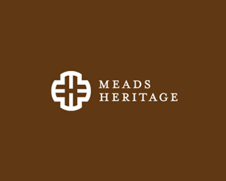
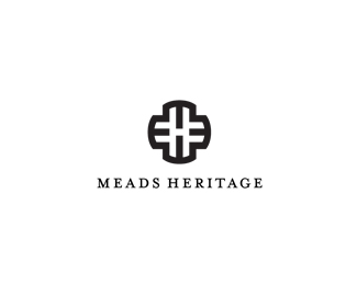
{Identity proposal for a local town council, focusing on a area called Meads.
The mark is formed from 4 letter m's forming the outer ring, with the 'h' formed from the negative space, with a slight adjustment on the vertical.}
The logo will be used mostly on signage, specifically brown road signs, where the logo will be white out.
Altered text position as well, to better suite the sign use.
This is where I feel it really works best, simple and clean, but quite bold and memorable. Easy to read from a distance.
So thank you for those who commented, it helped me steer this away from a more 'detailed' approach. Still conceptual right now, at the presenting ideas stage.
As seen on:
http://imjustcreative.com/
Status:
Client work
Viewed:
7983
Share:

Lets Discuss
I like the mark. Maybe a sans would fit better with it though.
Replyyeah mark looks good.
ReplyI like it. Classy and it really does work. I'd work a bit in the type. I like the choice of font, but maybe using smallcaps to emphasize the M and the H would work. **ps. i am the 666th viewer...kinda creepy
ReplyPlease login/signup to make a comment, registration is easy