
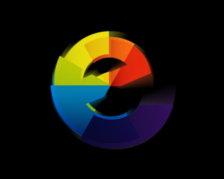
Float
(Floaters:
7 )
Description:
technology mark for a company ... wanted something simple ...
feel free to comment ... give me your thoughts
Status:
Client work
Viewed:
2295
Share:


Lets Discuss
wow... think thats beautiful!!! lets be buddies lol... no harsh words here... %3B) really though thats nice... i see an 'A' %26 'K' %26 'B'...???? ... am i makin things up? oh %26 a 'C' LOL... come to think of it... slightly 'adobe'?
Replyhmmm possibly slighty.. never thought of that ... ill chuck the red variant away
ReplyVery classy. The curves give it great depth Kaimere
ReplyThanks firebrand ... something irks me about it ... though... just seeing if anything bothers you guys
Reply...and a 'T'...
ReplyNothing really... just curious as to what it represents... I also see an A and a T.
ReplyI really like the dynamics. It's a nice mark, kaimere. One minor thing that bugs me is the curve where the two shapes overlap at the top. I feel the right side of it can be tweaked a bit to flow better. Very minor. Nice job!
Replythanks dude .... think ill give it an hour of tlc lol *
ReplyMaybe the end of the tail should not touch the shape on the left?**Very nice mark indeed.
Replywhat if the top shape wasn't see-thru? maybe that would make it look more %22solid%22...just a thought...
ReplyKaimere, what is the signficance of making it see-thru? - (what luckysign is referring to)%0D*%0D*Does that change your feeling on this if it was solid?
Replywell we have rationalised an abstract concept behind technology being intangible and ever changing. Plus with their levels of business it was allow seen to show another element ... **And solid looked a bit to heavy...
ReplyI'm sorry - what?
Replywhat didnt ya get minus my typo?
ReplyNice one Kaim!
ReplyThe only part I understood was that the solid looked a bit too heavy.%0D*%0D*The first part confused me.
ReplyPlease login/signup to make a comment, registration is easy