Float
(Floaters:
1 )
Description:
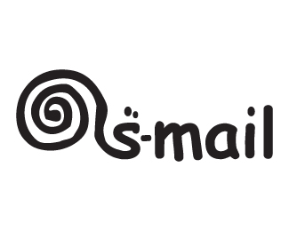
the only time i get to use comic sans :) ... wooooo ... for a storage e company
Status:
Nothing set
Viewed:
2151
Share:


Lets Discuss
Yo, Kaimere! I really like this concept. I even like the unperfectness of it. The 'mail' part, though, seems too heavy in comparison to the rest of the logo. Also, to get away from comic sans, since this logo name is so short how about creating your own type? Just some thoughts for you...all in all, it's rockin!!
ReplyHeehe thanks dude ... i quite enjoyed using comic sans,,, he actually wanted a font he could easily use on his computer so comic sans it is .... this dude is cool but takes consistency to a new level ... may do just for fun ... pretty inspired on the fonts movement ... check out Doyald Young - truly inspirational guy
Replyhaha... love it dude! the snail is awsome... yeah comic sans rocks... just finished illustratin a comic... nothing but comic sans all month!!!... wooooo...%26 yeah guys.. check out Doyald Young... he's taking it to another level!!!
Replylets start the comic sans movement and see if we can get it to last longer than a minute ..... errrr or a second
Replydamn you got issue with comic sans then :) as they say every font has a use ... quite interestingly enough if i remember correctly 40 designers showed comic sans in its full glory 3-4 years ago in creative review... great issue ... **but at least we know comic sans is bad a%24%24 now and not to be messed with ... seems i got off lightly
ReplyLOOK OUT BEHIND YOU!!!!!
ReplyI keep reading this as ass-mail.
Replywow ... really .... where you getting the extra 's' from ?
ReplyPlease login/signup to make a comment, registration is easy